

Over the last couple of weeks, I worked on a project to test a website that I thought could use a redesign. I choose CNN because every time I use the site, I can never find what I’m looking for. I know that CNN probably has a team of designers always working on the site to improve it, but I still constantly have trouble. My initial opinion was that there were too many breaking news headlines at the top, and there were no links for social media on the homepage. After completing several user design tests, I found much bigger problems.
The Methods
The competitor analysis provided a baseline perspective into the current design of CNN’s homepage, and the homepage of its competitors. By comparing each site, the research team can assess their individual strengths and weaknesses. Then, the personas and scenarios helped the team create various imaginary users with different demographic information to ensure that the homepage satisfied its audience. After the personas were created, the team was able to create an interview, survey, card sorting, diary study, and usability test to give multiple perspectives into how users interact with the site.
- Competitor Analysis
- Personas and Scenarios
- Interview
- Survey
- Card Sorting
- Diary Study
- Usability Test
The Problem
Through various user-centered tests, I discovered several issues with the current design of the website. The most prominent issue is that there is too much information on the homepage that goes unutilized by users. Another significant issue is the search bar navigation. During the usability test, most participants were frustrated with the lack of results while using the search bar. Lastly, there needs to be a reorganization of information. Too many key elements, such as the In Case You Missed It section and the Newsletter subscription options, are buried within the site.
Recommendations
After assessing all of the information, I came up with three essential recommendations for a redesign.
- Remove unnecessary content in the main body of the homepage.
- Provide section headlines to come up in the search bar.
- Move the In Case You Missed It section and Newsletter subscription option to the header or the footer of the homepage.
First, they need to remove the unnecessary content in the main body of the homepage and dedicate it to breaking and trending news topics. The participants in the usability test did not look at the middle of the homepage for navigation. Instead, they focused on the header and the footer of the website to navigate it.
Second, the participants of the usability test struggled to use the search bar when conducting their search of the site. The search bar only suggested related articles but did not show suggested webpages or sections found on the site. By adding pages and sections to the search bar, a keyword search will allow users to have a smoother experience on the site.
Lastly, they need to relocate the In Case You Missed It section and Newsletter subscription option to the top of the homepage, as all of the participants of the usability test used the header and the footer for navigation. If the information is presented in places that the user will frequently be visiting, then there will be less confusion and a better user experience.
Competitor Analysis & Personas and Scenarios
It is crucial to analyze CNN’s competitors to assess the strengths and weaknesses of the site, but it is also essential to determine the audience as well. Personas and competitor analysis will lay the foundation of who the site is being designed for and how it compares to its competitors.
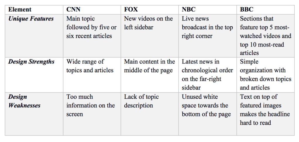
To get a better understanding of CNN’s website, I looked at Fox News, NBC News, and BBC News to see how their sites compare. CNN fell short of unique features and design strengths but won design weaknesses. CNN’s best feature is providing multiple topics of news (e.g., sports, business, health) followed by five or six recent articles about the topic. After completing all of the studies, the feature that made CNN unique was actually useless.
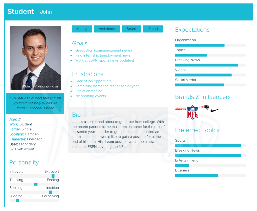
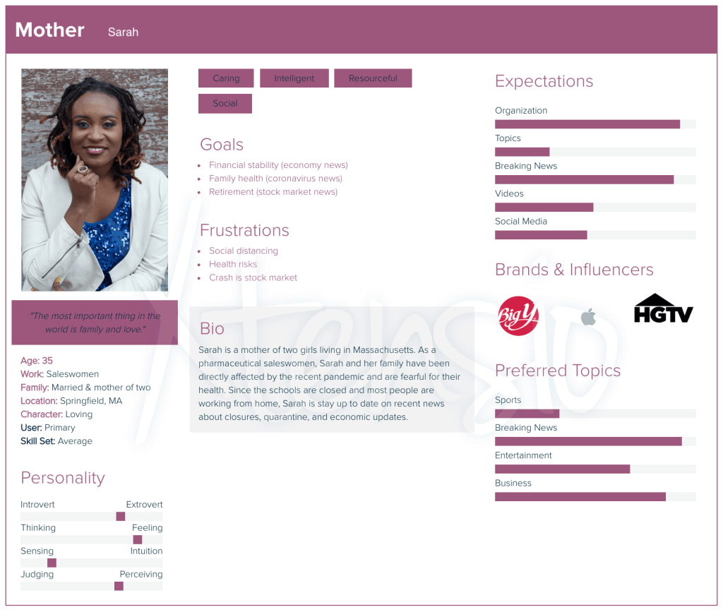
Next, I created three personas to help fill the void of creating for an “audience.” Instead, it was easier to research what Mary, John, and Sarah might need and want.

The Interview, Survey, and Diary Study
For this part of the project, I didn’t actually accumulate results, but I still designed each study. I came up with questions for each study.
Interview
For the interview, I came up with ten questions that centered around what worked and didn’t work for the CNN homepage. If actually conducted, I think this method would provide great insight into what to look for in future studies. Here is the list of proposed questions:
- When did you start using CNN?
- What elements drew you into the site.
- What is the first thing that comes to mind when thinking about CNN’s website?
- What is your favorite element of CNN’s homepage?
- Why?
- What is your least favorite element of CNN’s homepage?
- Why?
- What feature of CNN’s homepage is most important to you?
- Why?
- If there is one thing that we should definitely keep after updating the site, what would that be?
- If there is one thing that we should definitely change after updating the site, what would that be
- How is the navigation of the website?
- Could you walk me through your average experience with the homepage?
Survey
The survey was pretty close to the interview in terms of questions. I asked 20 questions based on current thoughts and feelings about the site.
I have used surveys in the past for different classes and my leisure. I really like this method for gathering information because you can reach a broad audience, but it only offers so many options. For a redesign like this, I would use a survey at the very beginning of the process to create a general idea of the current state of the site.
Diary Study
If you don’t know, a diary study is like a daily survey that allows a research team to gather information every day (or a week, depending on the study). A diary study is an excellent opportunity to see the user’s patterns while interacting with the site.
I came up with a few questions that a participant in the study would answer every day. Here are the six questions:
- What was your goal?
- search
- notification
- browsing
- other ____
- Did you reach your goal?
- yes
- no
- If no, please explain
- ______________________________________________________________
- If no, please explain
- Please give a brief description of your actions during your session.
- ____________________________________________________________________
- Did you experience any frustrations?
- yes
- no
- If yes, please explain
- ______________________________________________________________
- If yes, please explain
- On a scale of 1-10, how satisfied were you with the experience?
- 1 = terrible 10 = fantastic
1 2 3 4 5 6 7 8 9 10
- Why?
- _____________________________________________
Card Sorting
I had never heard of this method before, and I was eager to learn about it. For those that don’t know, a card sorting activity involves providing 30-50 index cards with various elements of a website (these could be topics, functions, or interfaces) that a participant will organize into categories that make sense to them.
I came up with 30 cards and recruited a couple of people to participate online using OptimalSort, and the results were shocking.
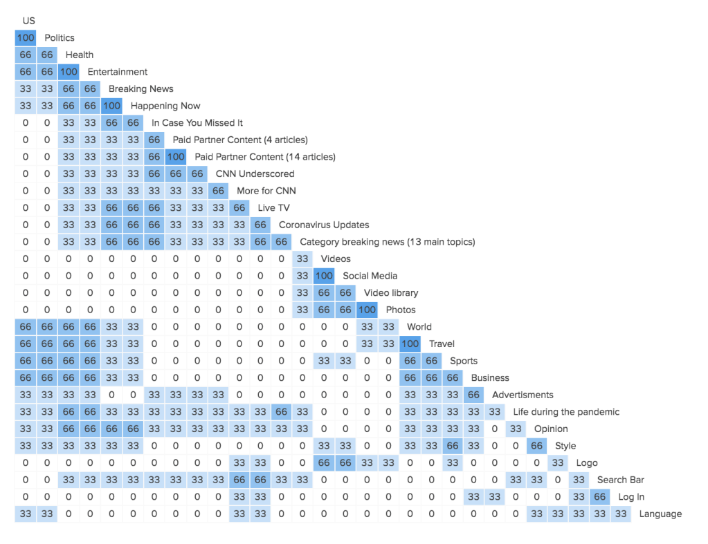
I thought that participants would create categories that were similar to how the site is today, but I was wrong. There were several groups that the users put together (dark blue sections). The data indicated that the various clusters of topics indicate that the participants grouped those topics together. The higher the percentage, the more they were grouped together.
The biggest take away from the card sorting was people expected all of the media to remain together.
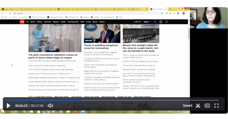
Usability Testing
This method was my favorite research method. A usability test allowed me to Zoom several family members and ask them questions about the CNN website. It was really cool to get an inside look into what they were thinking while they were interacting with the site.
After I got their initial opinions, I asked them to complete five tasks. These challenges were more like scenarios, and it was up to the participant to complete the task. Here are the five tasks that I asked the participants to complete:
- You saw a Tweet from CNN earlier in the day, but you can’t find it on your Twitter feed. Locate the social media links.
- You heard on the radio about a heartwarming video going viral. Locate the video section of the website.
- You want to get the latest news in the sports world. Find two ways to get to Bleacher Report.
- You heard an interesting story during last night’s news segment. Locate the In Case You Missed It section.
- You want to stay up to date with the latest news. Find the sign-up form to subscribe to their Newsletter.
Each of the three participants interacted with the site differently and for different reasons. After looking at their results, I came up with a few problems that they encountered.
There are several problem areas with the CNN homepage. Most of the participants looked at the header and footer for navigation. With no proper heading, the participant had difficulty locating important aspects of the page. Another issue was that the participant didn’t actually look at the stories in the middle. They were scanning at the top and bottom of the page for the information. Here is a list of my recommendations based on the tasks:
- The social media links should be relocated to the top of the page. Two out of three participants started their search at the top of the page.
- The video section on the homepage is not needed. None of the participants browsed the section but selected the link in the header or the footer.
- The Bleacher Report affiliate should be suggested when a viewer searches for sports articles. All three participants had difficulty with the task.
- The In Case You Missed It section offers the viewers a chance to still see recent news stories and should be moved to the top of the page with the trending topics. This keeps like subjects together as well. All three participants had difficulty locating the section.
- The Newsletter link was also tricky to locate. The search bar should prompt the viewer to the subscription page. If a viewer has difficulty subscribing to the website, CNN has the potential to lose business. Two out of the three participants had trouble locating the option.


In Conclusion
Though this whole process, I learned that there is no perfect website and that even some of the professional sites still have problems.

Leave a comment