
“It is not true we have only one life to love, if we can read, we can live as many lives and as many kinds of lives as we wish.”
― S.I. Hayakawa
Introduction
As an avid reader, I have multiple bookstores websites saved to my bookmarks. From ranges in price to different book covers, I constantly browse different sites to get the best possible deal and add to my endless collection of books. Two of my favorite websites is Barnes & Noble and Waterstones. Barnes & Noble is one of my go-to websites because I am a part-time employee at B&N and receive a generous discount, but sometimes it can be tricky to use. I also like Waterstone because they are a UK company and provide different book covers and a slightly different set up than Barnes & Noble.
The Process
But, which one is easier to use? To find out, I compared each one side by side and focused on my feelings and needs while interacting with each site. To define my thoughts, I used a feel/need statement. I feel ______ because my need for _______ is/ is not met.
For example, when looking at Waterstones’ navigation bar, I feel APPRECIATED and CALM because my need for ORDER and PURPOSE is met. The simplistic navigation bar gives just the right amount of options to navigate the site without providing too little information.
I also looked at each element from a User Experience design (UX) or User Interface design (UI) perspective. UX design focuses on the practical and emotional experience of the user toward a product or service, and in this case, the websites. UI focuses more on the look or aesthetic of the website. Both are important for a user, but a website can look amazing and function poorly or look outdated but function correctly. It’s important to find the perfect balance for the user.
The Order
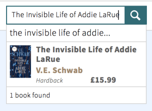
I started this process by following my normal shopping process—starting at the homepage, checking out what’s new, and logging into my account. From there, I looked around each account, looked at the navigation and search bar, and looked at the product description page on my favorite book, The Invisible Life of Addie LaRue. Lastly, I looked at my cart, the check out process, and looked at each site’s loyalty program.
Conclusion
After assessing my feelings and needs, I concluded that I enjoyed the usability and presentation of the Waterstones’ website more than Barnes & Noble.
Waterstones provided me with an enjoyable experience. It had clear labels, a simple navigation bar, and the site was easy to navigate. I loved interacting with the search bar. Seeing the book cover pop up in the search results made me excited to get to the product display page. I also loved their aesthetic and color palette. It felt clean, modern, and I liked the layout. Overall, I only felt positive emotions while using the site and felt motivated to use the service again.
Barnes & Noble provided a lot of helpful information, but it made me feel indifferent and overwhelmed at times. There were too many labels, a busy navigation bar, and sometimes the site was challenging to use. There were multiple times where I saw coding if I clicked on a link, which was very confusing to me as a user. I did try to keep in mind that their servers were hacked a few months ago, and as a result, their website has been having problems, but it was still very frustrating to see. The search bar also gave me three options for a book while giving me the same options on the product page, so the information is redundant. Lastly, the aesthetic of the site had some problems as well. The photo on the main page didn’t load, and there didn’t seem to have a consistent color palette. Overall, I didn’t have the best experience while using the site, so it made me question whether I would use it again.
Check out the full list of findings here!

Leave a comment