
“Information architecture is the practice of deciding how to arrange the parts of something to be understandable.” – The Information Architecture Institute
Information Architecture (IA) is often used in user experience (UX) design. It is an organizational method that lays out content in an effective way.
There are many different types of information architecture. From site maps, content audits, and IA diagrams, these various methods allow the designer to break down all of the present information. These methods might seem similar to common UX methods, but they focus more on the content than the layout.
“Where IA and UX differ in the early stages is in deliverables. Where UX may provide wireframes, and layouts, IA results in spreadsheets of documented content, and the two come together creating flow diagrams to map out content, and the surrounding experience.”
– Matt Rae, Adobe UX Ideas
To make sure the content is organized and laid out correctly, there are eight principles of IA that every designer should follow.
- objects – information is organic
- choices – keep choices minimal
- disclosure – be transparent
- examples – show examples of content
- front doors – allow users to navigate the website without the homepage
- multiple classifications – offer multiple schemes to browse the content
- focused navigation – keep it simple
- growth – allow room for content to expand
Designers should keep these eight principles in mind when creating information architecture for a website.
Creating My Own Information Architecture
Assessing A Website
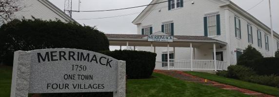
To practice putting together my own IA, I looked at my hometown website. I am originally from a small town in southern New Hampshire with a strong focus on outdoor activities and history.

The website lacks a modern aesthetic but provides a simple color pallet and hierarchy of information. The header allows the user to know they are on the main landing page and shows a slideshow of different locations around the town.
The navigation bar features the about page, departments, boards, community links, and economic development pages. Some of these pages are just a list of links, where others take you to different websites.
Underneath the header is the Merrimack Resources box. This houses very important information like online payments, town code, FAQs, permits & forms, and more.
To me, the information and links in this box should be available in the header. That way, a user can access these crucial tools on any page on the site instead of just the homepage.
Break It Down
To get a better understanding of the site’s information architecture, I used the online tool Smartdraw to break down each page. I started with the top header and worked my way through each page.

Some main pages had more information than others. Three out of the five pages had other pages related to the main topic, but the others just had a list of links or phone numbers.
Since the Merrimack Resources box had a lot of important information, I decided to break that down to see what kind of information was hidden.
Most of the pages in the box sent me away to another site. Property taxes, Merrimack GIS, and Town Code all sent me to different websites.
For me, it seemed kind of weird that the information was all over the place and not in one consistent spot. Plus, the hierarchy of information seemed off as well. How often are people looking for specific boards over paying a bill?
Rearrange
After completing the initial information architecture, I started to see patterns and new ways of reorganizing the information that might be more helpful for a user.

I scrapped the original navigation bar for something more simple and straightforward. I broke it down into resident, business, government, departments, and I want to…. pages. This makes it a lot easier to find information based on what kind of user is on the site.
I then broke down the resident into two sections, local and visitor. I did this because I saw a lot of tourism links on the original site, but a lot of the locals already know where these locations are. I also didn’t want to give the visitors page its own tab because Merrimack is a tiny town and doesn’t have a large tourism market.
Next, I took a look at the business elements of the site. To me, a lot of the items were separated and could be combined into one location. Most of the information on the current website under Economic Development got reworded to Business in Merrimack more make the information more transparent for users. When I think of the term economic development, I think of the past and not the business’s current or future state in town.
Then, I took a look at anything that could go under the government tab, such as boards, town hall, budget, and more. I also put voting here again because around election time, it is hard to find voting and registration information. By providing the information in two locations will hopefully provide less confusion in the future.
Lastly, I added a departments and I want to… page as well for quick and easy access. The department’s page will have a list in alphabetical order of all the town’s departments with addresses and phone numbers. The I want to… page will have an alphabetical list of pages for easy access if someone isn’t sure what they are looking for.
Conclusion
Overall, the main goal of creating this information architecture was to make information and content on the site easier for the user to understand and follow. By rearranging the information and condensing titles, the user should have an easier time navigating the website.

Leave a comment