
The fourth step in the design thinking process, prototyping, can be done in many different ways. One of these ways is through paper prototypes. This method gives a lot of freedom for the designer and the team.
“Paper prototyping is a process where design teams create paper representations of digital products to help them realize concepts and test designs. They draw sketches or adapt printed materials and use these low-fidelity screenshot samples to cheaply guide their designs and study users’ reactions from early in projects.”
– Interaction Design Foundation
Making paper prototypes is somewhat easy. After gathering materials, usually, they are rather inexpensive; it is time to get to work.
Tools
To get started with making paper prototypes, you’ll need all types of crafting materials. Here are a few to get you started:
- paper
- sticky notes
- pencils
- erasers
- markers
- pens
- scissors/ Exacto knife
- glue
- index cards
- tape
- highlighters
- tracing paper
- cardboard
These materials offer a wide range of different materials to choose from when creating prototypes. It is great to have some of these items stored for future toolkits.
Prototyping for Different Devices
From desktops, tablets, and mobile devices, there are many different screen dimensions that the designers should keep in mind. For example, when designing for a computer, the designers should construct the paper prototype to fit the real-life dimensions of the screen.
Elements
This is where things get creative. When incorporating elements into your prototypes, don’t be afraid to think outside the box. Different colored paper, icons, 3D models, or more, allow the user to see the prototype as the real thing.
Making My Own Paper Prototypes
A couple of weeks ago, I started to look into creating a mobile app from my hometown’s website. From information architecture to flow charts, my design has changed multiple times since I started the project.
I started off wanting to provide services for both residents and businesses, but after further revisions, I decided to focus more on the resident as my audience instead of business owners. Now, business information will be available on the app, but things like forms, applications, and permits will no longer be supported on the app, but the residing information will be available.
Now that I have my target user set, it is time to make some paper prototypes.
The Process
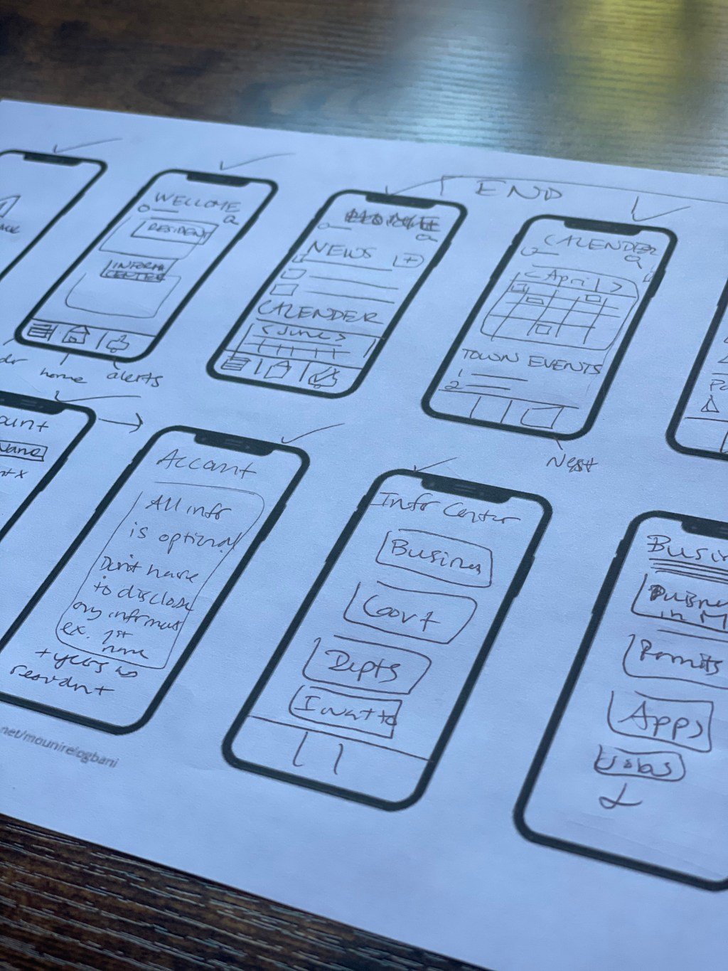
I had an idea of what I wanted the app to look like in my head, but I hadn’t had a chance to put it on paper yet. So instead of diving right in, I created some low-fidelity sketches. I printed out a template of ten iPhones to get my brain flowing. This gave me time to add, subtract, and rearrange screens as well as add new ideas I hadn’t thought of before. For example, when I was creating the home screen with news, town calendar, and alerts, I thought of the idea to add an option to rearrange the order of widgets in case the user didn’t care for one option or another. I also added an optional profile page and got rid of the town forum options. I added the profile page because of the reporting option, and I dismissed the idea of a town forum because they are already established on Facebook and other social media platforms. It seemed redundant to have the user post in both places.

After creating these preliminary sketches, it was time to create something that represented what the app could potentially look like. I started off printing another template and getting to work. This time, the template was perfectly scaled with a real iPhone. It allowed me to draw everything to the size it would actually be on a real app. It also allowed me to add more detail than the preliminary sketches.
Next, I grabbed some crafting supplies. I didn’t have much, just some paper, colored pencils, markers, tape, index cards, and paint. I knew I could make this work as long as I had paper and three to four different colored markers/pencils.
For my prototypes, I used paper, markers, pens, index cards, and tape. I then focused on the main pages of the app. The process took me a lot longer than I initially thought. It took me several hours to draw up and color each prototype.

I started with the login, welcome, and home page. I was originally going to make the welcome page and home page the same thing. But, then I thought that it would be a weird combination of information. Even now, I am thinking that I should rename the Welcome page because it is a page that people could come back to at any time of their experience.

I think the navigation of the app is clear and straightforward, but I would make one simple change. For all of these prototypes, I have the title at the top bring the user back to the main navigation screen of the welcome screen, but now I think that it should be a button in the bottom navigation.
Conclusion
Overall, this is one of my first thorough prototyping sessions, and I would say it went kind of well. I definitely should have made more preliminary sketches because, by the time I got through half of the prototypes, I wanted to change things overall. I already put hours into the ones I had already completed, so I added the changes to my notes for the future.
This whole experience showed me that prototypes are not the final product, far from it, and that’s a good thing. I felt a little defeated when I realized I wanted to change a few things, but that just showed me that there is always room for improvement to make the design better.
Lastly, these prototypes made me excited to test them out. I am eager to see what other people think and to see what they would add, take away, or move. I already have a few predictions for what people are going to say, but in the end, it will make the app better than before.

Leave a comment