
For years, I have wanted to learn how to use Photoshop, InDesign, and Illustrator. I mostly wanted to learn how to create the beautiful graphics that I see on the Internet and social media.
This week I explored Adobe Illustrator to replicate an abstract painting. I chose Illustrator because I was slightly familiar with the shape tools, but I wanted to explore them more in depth. I knew the experience was going to be a challenge, but I was excited for the task. I watched the Adobe tutorials and YouTube videos to get a feel of the software, and I was feeling pretty confident that I would pick up the skills quickly.
The Painting
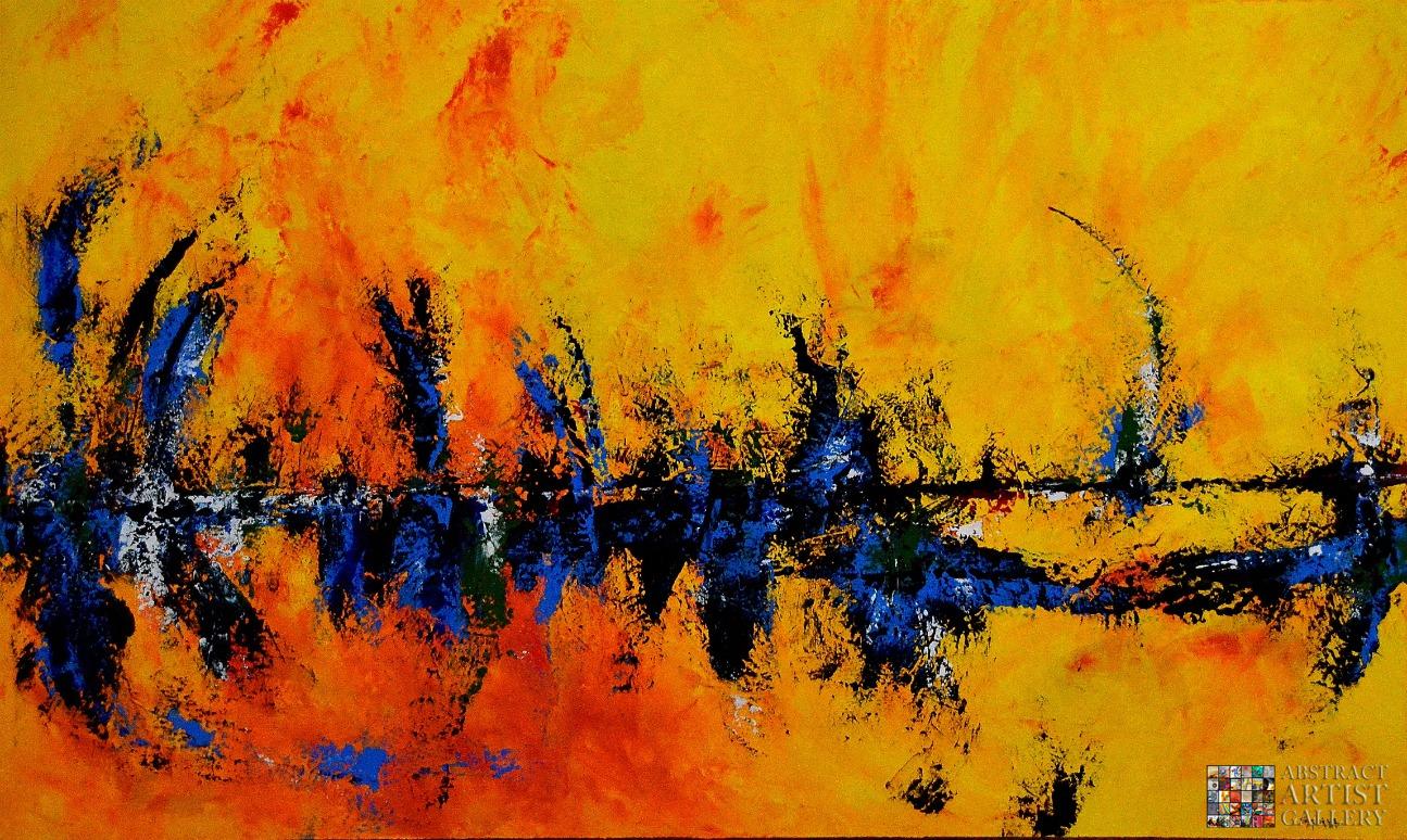
Before I could get started, I needed to choose a painting to replicate. I stumbled upon the work of Sabina D’Antonio. I loved her beautiful beach-inspired pieces, but then I saw her work for the Abstract Art Gallery.

*I do not own the rights to this image or painting*
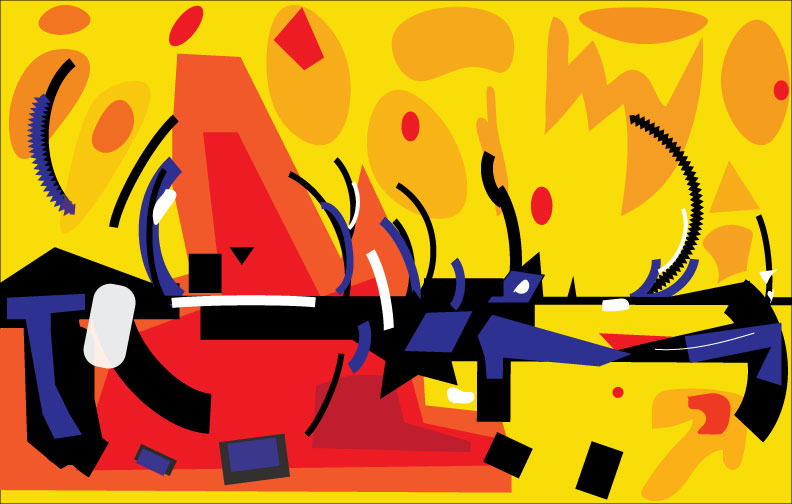
There are multiple elements that I enjoy about this painting. I love the bold colors and contrast between the bright and dark pigments. Next, the curvature of the darker lines keeps my gaze on the canvas the whole time. Lastly, the layers of color add a subtle depth to the image that I think is playful and creative.
My eyes first land on the bold black line that falls horizontally across the canvas, as if I am reading the line from left to right. My gaze then drifts to the long curved line that leads me to the bright yellow space toward the upper right corner. According to Mark Boulton, this is active whitespace.
“When whitespace is used to lead a reader from one element to another, it’s called “active whitespace.”
Mark Boulton
The single black line in this active whitespace leads me toward the left side of the painting and back down again, in a never-ending oval.
According to Rune Madsen, with the Program Design Systems master’s class online website,
“design is a journey from complexity to simplicity… constraining yourself to three simple shapes can still give a million different outcomes.”
Rune Madsen
The collective group of complex shapes overall makes one large oval. Since my eyes are continuously rotating, my gaze doesn’t leave the painting.
The bold contrast of the red, black, and blue provide a depth to the canvas as well. The red and yellow seem blurry and far off in the distance, while the black, blue, and white are detailed and up close.
Simplification and Mimicking in Illustrator
After learning the simple shape and construction tools, I got to work. I faced multiple challenges while working on this project, but I learned a lot from this experience.
My first issue was getting the colors correct. I wanted to mimic the same colors as the original painting to make sure there was a cohesive connection between the two mediums.
My next challenge was to recreate the brush strokes. I knew that I needed to simplify the image to something that I could produce. I quickly used the pen tool, the curvature tool, the rectangle tool, and the pencil tool to draw similar and straightforward shapes.
Once the shapes were in place, I need to make sure the proportions were similar to the original. By resizing, rotating, flipping, and changing the stroke size I was able to reshape the lines and objects to my desired specifications. Even with similar proportions, I was still not able to mimic the asymmetrical feeling of the original.
D’Antonio’s painting keeps the viewer eye on the canvas the whole time due to the placement of the lines. In my rendition, the spots of color, even with a lower opacity, draw the viewer’s eye away from the canvas in the upper right corner. With more experience, I would hope to find another solution.
In Conclusion
My favorite part of this experience was playing with the different effects of the lines and shapes and getting to know the software. For a while, I was using different gradients for the bold red and orange backgrounds. In the end, I determined that the gradients were unnecessary because they didn’t reflect the same effect as the original piece.
This experience has taught me the importance of whitespace and decision making. The use of active negative space allows the viewer to travel from one element to another. It is also essential to make the correct decisions to place the shapes and elements in the most successful locations. I can’t wait to use Illustrator in the future.
References
Boulton, M., Metts, M. J., Welfle, A., Perez-Cruz, Y., Gustafson, A., Wagner, J., & McKnight, T. (2007, January 9). Whitespace. Retrieved from https://alistapart.com/article/whitespace/
Madsen, R. (n.d.). Basic shapes and relationships. Retrieved from http://printingcode.runemadsen.com/lecture-form/

Leave a reply to Blake Cancel reply