
The scent of lavender can alleviate a fraction of the stress from our daily lives. From work to traffic, there are many triggers during an average day to cause anxiety, and aromatherapy is a natural solution.
According to Healthline, “lavender is most commonly used in aromatherapy. The fragrance from the oils of the lavender plant is believed to help promote calmness and wellness. It’s also said to help reduce stress, anxiety, and possibly even mild pain.”
The scent of lavender is special to me because I have always had a difficult time falling asleep at night. Either from stress, afternoon coffee, or the dog barking in the apartment above me, there is usually one little thing that keeps me up at night.
I have tried many different options, but a combination of flow yoga and lavender essential oils right before bed has been very calming these last couple of weeks. Unfortunately, as of three days ago, my nightly routine has recently been interrupted by a stuffy nose due to a common head cold. I miss the scent dearly.
Breaking Down Type
This week I got to experiment with typography in Adobe Illustrator. I got to learn the basics of type anatomy, the difference between a typeface and a font, and what serifs are.
I had no idea that a font can be broken down into several parts. For example, the line that lowercase letters sit is called the x-height (Landa, 2019, p. 38). If a letter breaks the top of that plane, it is called an ascender, such as b, d, f, h, k, l, and t (Landa, 2019, p. 37). If a letter breaks the bottom of the plane, it is called a descender, such as g, j, p, q, and y (Landa, 2019, p. 37).
There is a lot more to type than the words they create. The size, angle, color, and style are all important choices when choosing the correct font.
Various fonts make up a typeface or a superfamily. Graphic Design Solutions by Robin Landa houses an excellent example of a type superfamily. Fonts like “ITC Stone Informal Medium, ITC Stone Informal Medium Italic, ITC Stone Sans Medium, ITC Stone Sans Semibold Italic, and ITC Stone Serif Bold,” are all a part of the ITC Stone typeface family (Landa, 2019, p. 39).
If you have never studied typography, then you might not have noticed the difference between serif and sans serif. A serif is “a small stroke added to the upper or lower end of the main stroke of a character” (Landa, 2019, p. 37). A sans serif does not have the added stroke. Now, when you look at all the different font options, you’ll see the difference between serif and sans serif.
The Graphic
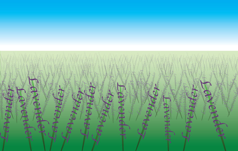
This week, I chose the word lavender and used typography to create its meaning.
My first challenge was choosing a font that accurately represented the aesthetic of lavender. According to Landa, “creating or selecting a typeface for its aesthetic value and the impact it will have on-screen or in print is as important as creating or selecting the image” (Landa, 2019, p. 45). To achieve this, I needed to select a font that was fluid and organic.
I ended up choosing Apply Chancery to represent lavender. The italic font looked perfect to represent the flower blossoms of the lavender plant.
My next challenge was to choose the right spacing for the letters, or kerning. According to a website dedicated to showcasing Ellen Lupton’s book, Thinking with Type, determining the right kerning is essential to make sure the text doesn’t look awkward and distracting (Lupton).
My last challenge was to come up with a creative design to represent the lavender. After a lot of trial and error, I decided to go with a field of lavender. This is what I try to picture when I’m trying to calm down for the night.
With more experience with Adobe Illustrator, I hope to add more detail and effects to make this design even better.
References
Lupton, E. (n.d.). Text: kerning. Retrieved February 7, 2020, from http://thinkingwithtype.com/text/#kerning
Landa, R. (2019). Typography. Graphic design solutions (6th ed.) (pg. 35-64). Australia: Cengage.

Leave a comment