Recently, I have seen Billie Eilish in the news everywhere. From her music, awards, and fashion, she has increased in popularity in the last couple of years.
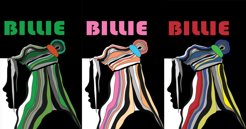
This week I checked out the work of Milton Glaser, specifically his portrait of Bob Dylan (1966). This week I created my own Glaser profile portrait of Billie Eilish.

Design
My first challenge was to find a profile portrait of Billie to use as her outline. Unfortunately, I couldn’t find one with her new green hair, but with her long silver hair. I decided to create the photo with her old hairstyle, but with the colors of her current hairdo.

Her hair was loosely thrown up into a half-up messy bun, so I decided to take small sections of her hair to follow the path of real hair. I tried to follow her hair just like in the photo.
Color
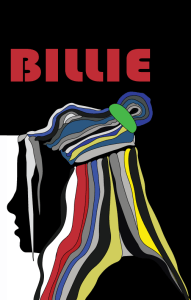
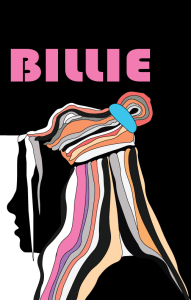
For this design, I played with three different color palettes. I first started with green monochromatic tones and values. I then recolored the image to showcase the primary colors of red, blue, and yellow (Baker). Lastly, I recolored the image again to create an analogous pink pallet.
Monochromatic
Billie’s bright green hair has become part of her fashion. Videos of her at the Grammys and Oscars have been plastered all over social media. According to Lindsey Kolowich, the color green health, nature, growth, and prosperity (Kolowich). Who knows if Billie had these ideas in mind, or she just like the color green. But for this design, the different tones of green work well together.

Complimentary
After watching a bunch of videos of color, color theory, and how our eyes process color, I decided to choose a palette of primary colors. The red, blue, and yellow break down the color to its roots.

Analogous
This is my favorite palette of the three. I wanted to choose colors from a pastel pink analogous palette. I took some advice from Jude Stewart and looked at Adobe Color to see what palettes I could create. After looking at analogous, monochromatic, triad, complementary, compound, and shades of different colors, I decided to go with these colors. I wish I knew these softwares existed because I have always struggled to come up with palettes on my own. Now with these tools, hopefully, I can create more compelling designs.

References
Baker, J. (2019, September 1). The Ultimate UX Guide to Color Design. Retrieved from https://medium.muz.li/the-ultimate-ux-guide-to-color-design-4d0a18a706ed
Heller, S. (2016, October 6). Glaser’s Ghosts. Retrieved from https://www.printmag.com/daily-heller/milton-glaser-ghosts/
Kolowich, L. (n.d.). Color Psychology in Marketing [Infographic]. Retrieved from https://blog.hubspot.com/marketing/psychology-of-color
Stewart, J. (2019, July 8). 51 Best Color Sites for Graphic Designers. Retrieved from https://www.printmag.com/article/50-best-color-sites-graphic-designers/


Leave a comment