
This week I designed an advertisement for Coffey’s Corner Book Reviews. Coffey’s Corner provides book reviews for the latest books in the industry.
Coffey’s Corner is all about quick, direct, and spoiler-free book reviews. Overall, the brand focuses heavily on simple reviews and simple photography. “The core brand narrative has to be the point of entry and foundation for all other specific stories to keep the brand message relevant, engaging, and on track” (Landa, 2019, 240). For the advertisement, I wanted to incorporate a simple, book-related design.
The purpose of an advertisement is to provide a “specific message constructed to inform, persuade, promote, provoke, or motivate people on behalf of a brand, entity, or cause” (Landa, 2019, 285). For this ad, I wanted to promote and motivate people to check out quick and simple book reviews.
The design
With keeping simple and book-related themes in my head, I started sketching out a couple of different designs. I wanted to take a picture of someone drinking coffee, but there was too much going on. It became more about the person in the photo than the actual advertisement.
I then elected to use a photo of a coffee cup with my tagline in the middle of the liquid. I then realized it looked more like a coffee advertisement than a literary review service.
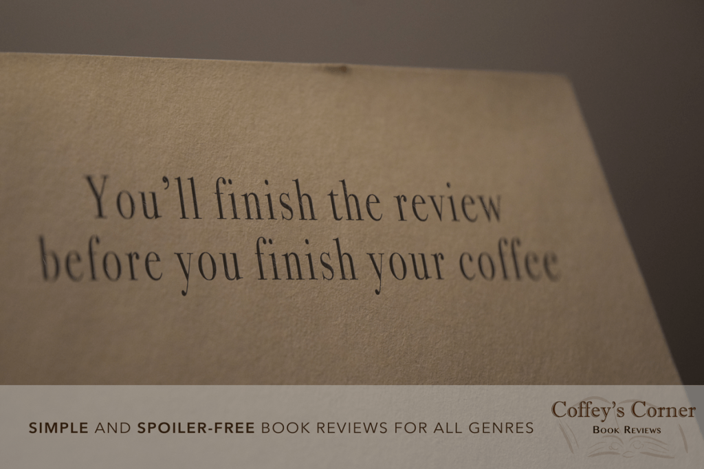
At this point, it knew the main image had to be a book to make the connection to the reviews. While I was flipping through the book I was taking a photo of, I decided to make the advertisement look like it was writing into a book.
After choosing an image, I needed to think of the headline, body copy, tagline, and inset the logo (Landa, 2019, 298). After much tweaking and editing, I finally settled on a headline and a tag line. For this add, I didn’t need a body copy because the photo is so simple.
After watching many tutorials to figure out how I was going to make the design, I got right to work adding the headline and tagline. I placed the headline in the middle of the book, so the viewer’s eye would be drawn there first. I then put the slogan at the bottom next to the logo so the viewer can see both elements. I quickly realized that if I made the headline look precisely like it’s in a book, then people might not realize that it’s an advertisement and not a picture from Instagram or Pinterest. I then chose a font with a tall x-height to make sure the slogan was eye-catching and memorable. Since the photo is taken with a shallow focus, I needed to make the text blurry at the ends. I did this because Coffey’s Corner Instagram features many photos with shallow depth of field. Overall, it matches their aesthetic.
Lastly, I wanted the color pallet to feature neutral colors, especially tans and browns. I chose to have both the headline and tagline in brown to connect to the logo and brand identity. I also chose to bold the words “simple” and “spoiler-free” because those are the two most essential elements of the review service.
The message
The overall message I wanted to send to the viewer is that Coffey’s Corner provides simple, quick, and spoiler-free reviews for all ages and genres.
References
Landa, R. (2019). Branding and Visual Identity. Graphic design solutions (6th ed.) (pg. 238-284). Australia: Cengage.
Landa, R. (2019). Advertising. Graphic design solutions (6th ed.) (pg. 285-327). Australia: Cengage.

Leave a comment