

What is data visualization?
Data visualization is a representation of information in a visual manner. This could be as simple as a chart describing the clothes in your closet, or as complicated as showing the rate of homelessness in various cities across the United States. The complexity level depends on the amount of data and the representation of the information through the use of different positions, shapes, hues, values, sizes, orientations, and textures.
The history of data visualization
Ancient Egyptians showed the first signs of data visualization using maps and grids to chart the terrane and stars. Then slowly, measurements and theories can into play that added more elements to each visualization. As data became more precise, so did the maps, charts, and graphs. There was an increase in the use of color, textures, and creative designs. Between the 1900s and 1960s, there was a lull in the innovation of new data visualization elements. Starting around the 1970s, visualizations began to gain traction again with the recognition of data analysis as a branch of statistics. Lastly, with the boom of computer systems, data visualization possibilities took off and developed into original designs that we see today.
Pros and Cons
Here are three disadvantages of the technological advancement of data visualizations. First, using data analysis software can be very tricky to learn and understand. From coding to using online platforms, it is easy to get confused about navigating these systems. Next, some of the technology can be very expensive. Some online softwares have trial versions to test out their systems. After the trial period is up, these platforms can become costly very quickly. Lastly, you also have misleading data. This information is extremely problematic, especially in situations that affect the public. (For example, this COVID graphic used on the news is entirely misleading, and I’m not even sure what they were trying to prove.)
There are also positives attributes as well. Data visualization offers a way of communicating data by simplifying boring numbers and presenting them in a creative way. Data visualization also helps identify trends, tells a story, and highlights important information.
What makes a good chart?
According to the book, Knowledge is Beautiful, there are four aspects that make up a good visualization; information, story, goal, and visual form. First, there is the data. This is the information that is displayed in the graphic. Is the information complete? Is the data misleading? Next, there is the story. What is the chart trying to tell me, and does it succeed? Then, there is the goal. What is the design trying to accomplish? Does it serve a function? Lastly, there is the visual display. Is the information displayed in a visual manner?
What do I look for in a visualization?
Design
My first impression of the visualization is the design itself. I am personally drawn to more abstract representations of the data, like this one. I think that they go above and beyond to tell a story with the data. Not to say regular graphs don’t tell stories, but I enjoy looking at a cool design as well.

I am also drawn to simple designs as well. I enjoy simple things, so looking at a straightforward design like this one can be refreshing to check out as well.
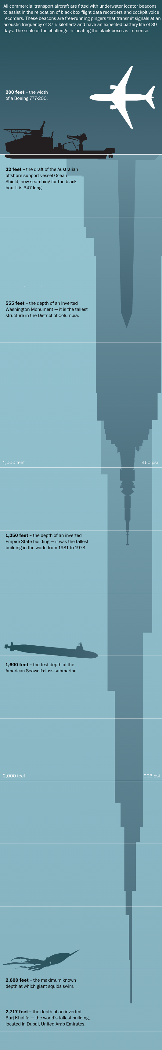
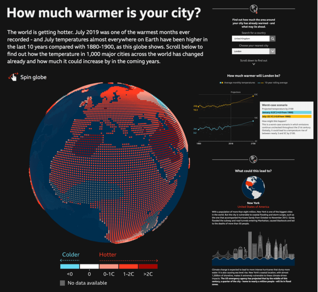
Lastly, I enjoy designs that represent the data in ways that I would have never thought of. Seeing light represented as mountains shows the viewer exactly where all of the major cities are across the world.

Interaction
Interactive visualizations are also compelling. I understand that they are incredibly hard to create, so there is a level of respect while looking at the design as well.
Color
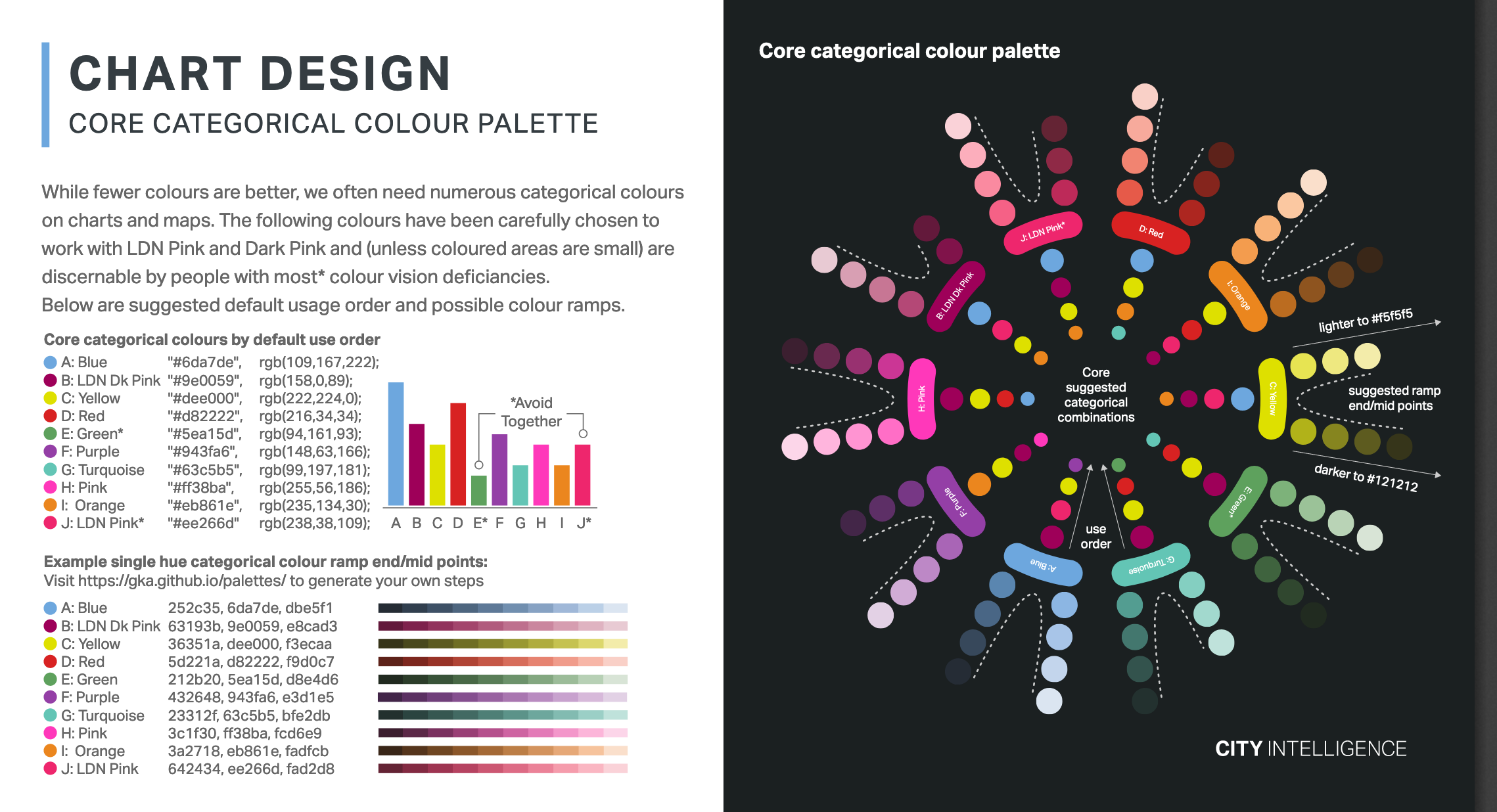
Another aspect that I look for is the use of color. This visualization here is just a template, but it is an excellent example of the colors that I look for in a design.
Here is another great example of a great color palette.

Subject
Most of the time, I want to be able to relate to the graphic in some way. When I am looking at a visualization about a topic that I am interested in, I want to learn more.
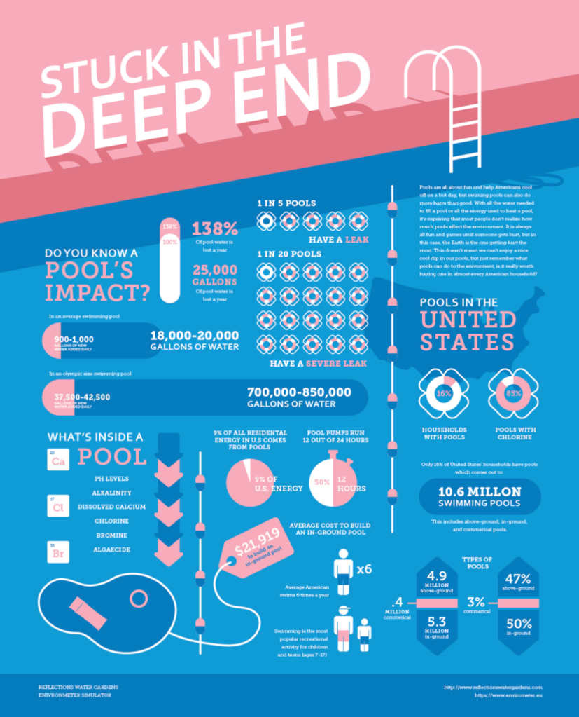
Another cool aspect of subject matter is that I could find a visualization of something that I would have never thought about before. I love to swim, but I have never had a pool of my own. This is a great example showing data that is all about swimming pools.
References:
Friendly, M. (2008). A Brief History of Data Visualization. Handbook of Data Visualization, 15-56. doi:10.1007/978-3-540-33037-0_2
Marchese, Courtney. “A History of Data Visualization.” PDF file.

Leave a comment