

Now that I’ve learned about datasets, it’s time to figure out how to create the visuals. This week I took a look at the online data visualization tool, Datawrapper to create some colorful and informative maps and charts.
I had many successes and failures while using the software. It is very easy to use, but there is a learning curve. Once I figured out how to make my data show up on the screen, it was relatively smooth sailing.
Failures
First, my global dataset featuring percentages of social media users from last week, was too broad to put into the system. Since it was broken down into subcontinents and not by country, I didn’t have enough information to enter the data correctly. My other failure was gathering data that doesn’t necessarily go together. At the time, those were the only two complete datasets that I could find, but looking at the data now can be misleading and infer that one element affects the other.
Successes
My first success was getting Datawrapper to read my other two datasets. From there, I successfully choose a chart type, selected labels, fixed axis, and played around with each of the settings. Overall, I think this a successful first attempted at collecting and visualizing data.
Charts
My main goal of the charts was to create a clear visual and to present the information in the correct manner. I was able to look at the information in different chart types, and I selected a scatter plot and an area line graph to display both of my different datasets.
Scatter Plot
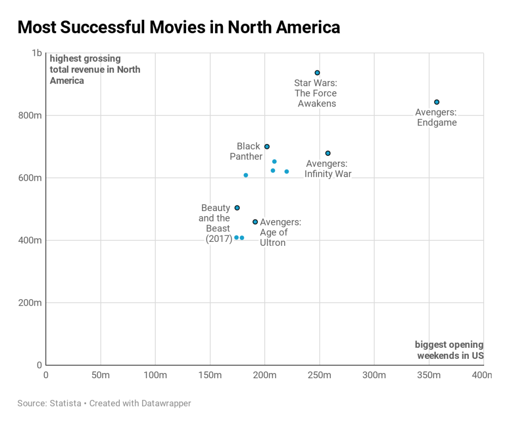
As a movie lover, I was interesting in finding information about the movie industry revenue, but only in North America. I was mostly interested to see if there was any relationship with successful opening weekends and overall revenue. To go a step further, it would be interesting to see what overall global revenue looked like, or maybe look to see if these movies were more popular in 3D, IMAX, or regular 2D.
Area Line Graph

Everyone has been telling me for years the book sales are decreasing and that brick and mortar stores are all going to go out of business within the next few years. And if you look at the numbers, they are right. From the information presented here, the user can see that recreational book sales decreased starting in 2008. After a quick Google search, it was interesting to note that social media became extremely popular during that time. That is to say that it is not the direct cause of the decrease in recreational sales, but the data posed the question of why did they go down in the first place?
I am very interested to see what the numbers will look like at the end of 2020. So far, book sales have taken a hit because of the pandemic, but with the growing interest of anti-racism books, who knows that the final numbers are going to look like.
Maps
Most of my time this week was dedicated to learning about the different types of map visualizations. According to How To Lie With Maps by Mark Monmonier, when you are looking at a global map, you are technically looking at a distortion of what the globe actually looks like. He says that it is important to keep these three key attributes in mind when creating a map: scale, projections, and symbols.
Since maps are not the actual size they represent, they need to be drawn to scale. The scale refers to the “one unit of distance on the map to a specific distance on the ground,” (Monmonier, 5). This is to make sure the map isn’t distorted and represents the data in an honest manner. Next, there is the projection. According to The Truthful Art by Alberto Cairo, projection is “the process of making a globe, or a portion of it, fit into a flat picture. Lastly, there are the symbols. These help to indicate key features on the map. According to Cairo, these symbols needed to me drawn to scale as well, especially if these pictures are representing area. If they are not drawn to the correct scale, the whole graphic will be misleading.
Locator Map
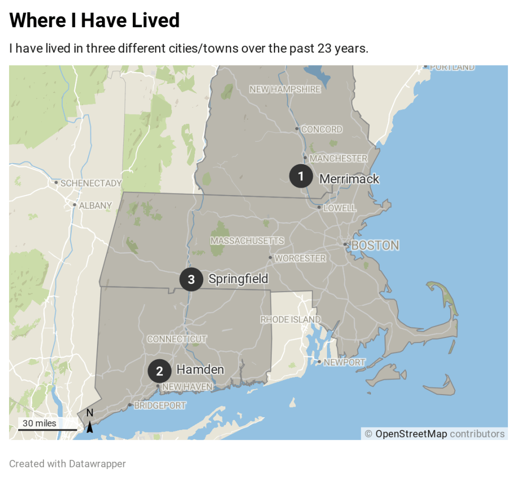
This map quickly shows the various locations that I have lived over the course of my life. To expand on this data, it would be interesting to see (not during COVID-19 quarantine) all the places that I have visited in a week, month, or year.
Symbol Map
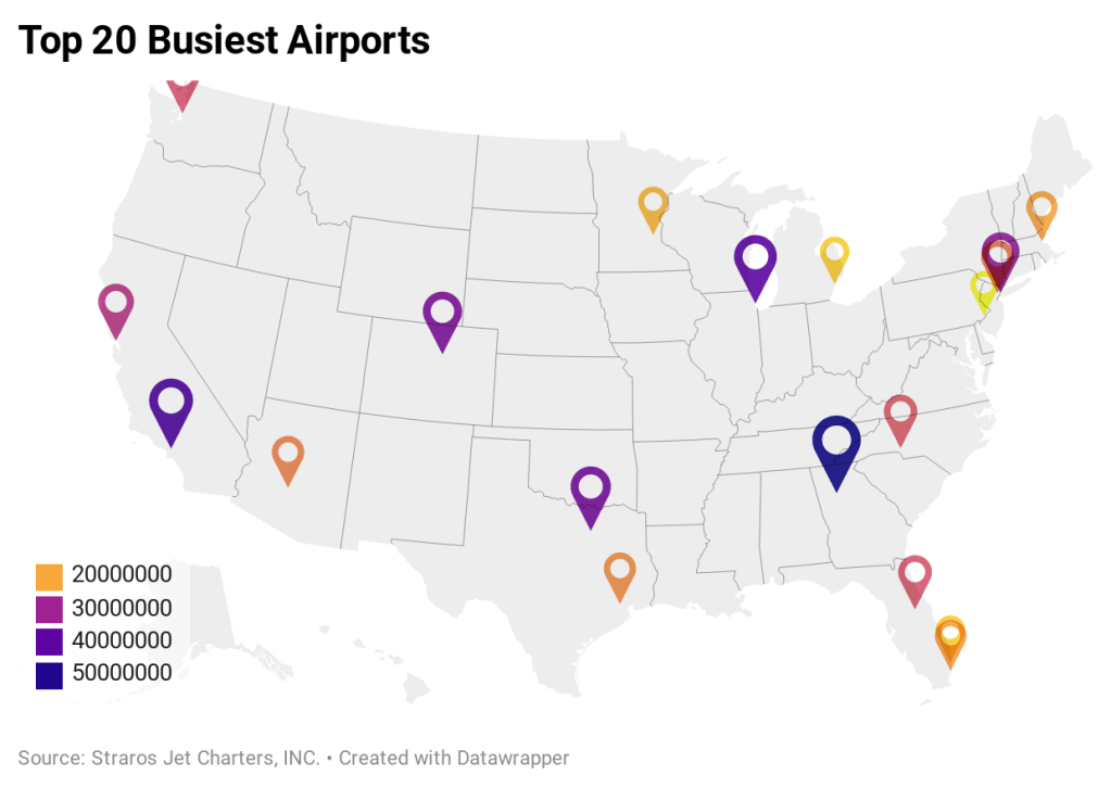
I don’t travel much, but I know a lot of people that do. I was very curious to see where the busiest airport in the US were located. Before I gathered the data I assumed that most of the airports would be on the East Coast with Miami being the most successful (it took me 45 minutes to walk from one gate to the other). It was interesting to see that it was Atlanta, Georgia with the most passengers within 2019. With the pandemic going on, I am interested to see how the virus has impacted the flying industry. To expand further, I would love to see which of these airports are the largest in size/number of gates and where the busiest domestic airports are located.
Choropleth Map
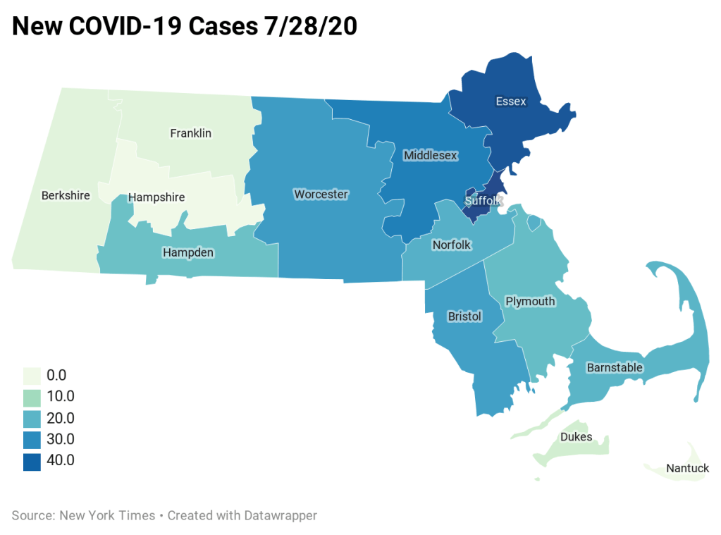
Covid-19 cases have been on the rise ever since the beginning of the year. Fortunately, Massachusetts has seen an incredible decrease in the number of new cases. Instead of in the hundreds, in each county there are only a few dozen new cases reported everyday. To expand more, I could add in the other New England states as well. From there I could expand to the rest of the US and the World.
Resources
Cairo, A. (2016). The truthful art: Data, charts, and maps for communication. Berkeley, CA: New Riders.
Monmonier, M. S. (2018). How to lie with maps. Chicago, IL: The University of Chicago Press.

Leave a comment