
This week I came up with a few ideas for a data story. This method of storytelling uses visuals with data to help convey a story. Edward Tufte, in his book, Beautiful Evidence, points out that creating a visual presentation with data is a “moral act as well an in intellectual activity” (Tufte, 141). He warns the reader not to cherry-pick, use incomplete data, and to overreach. These are perfect examples of presenting data in a wrong way. Data is incredibly persuasive, and it is my responsibility as a researcher to gather my data from reliable and honest sources to make sure I am telling a complete and unbias story to my audience.
The Process:
My article will follow as simple formate of an introduction, multiple key points, important takeaways, and a call to action.
Before we get started, I would like to point out that I am just brainstorming ideas and how to eventually display the information that I find. These choices are subject to change depending on the data. A graph that I think would look good now, might not be as accurate when I plug in all the data. Edward Tufte, again, reminds us that “certain methods for displaying and analyzing data are better than others” (Tufte, 27). He later explains in the chapter that using the wrong chart can mislead the reader and have monumental consequences.
Story #1: Hurricanes
Right before Hurricane Isaias hit the east coast, I had just finished reading A Furious Sky by Eric Jay Dolin. The nonfiction book is full of great information about the most powerful Hurricanes to hit North America over the last 500 years. All of that information inspired me to look into the connection between these mighty storms and climate change. Ever since I was a kid, I always heard, “this is a storm that happens every 100 years.” So what is my future going to look like if climate change continues to get worse? Are these storms going to get worse? Will they become more frequent?
My audience will be people that have been affected by hurricanes or people that enjoy learning about extreme weather.
Overview: What is a hurricane? (step-by-step)
Define: Types of Hurricanes (chart)
Key Points: Most Powerful Hurricanes (map) / Economic impact of Hurricanes (bar chart) / Residential impact of Hurricanes (bar chart)
Big Takeaway: Hurricanes and Climate Change (line chart)
Call to action: (scatter) donate / volunteer / hurricane education / carbon foot calculator

Storytelling Techniques:
As a rough draft of my story, I wanted to explain the basics of how a hurricane works and how they are categorized. I also wanted to highlight the most powerful storms and the economic and residential impact on the communities they affect. My biggest take away will be the connection of these hurricanes and climate change. I want my audience to be enlighted and reminded of the sheer destructive power of these storms. Lastly, I want to create engaging content for my audience and provide multiple interactive charts and maps for my readers to explore.
The Aesthetics
To make all of the graphics look connected, I plan to use the same color palette, marks, orientation, typography, and imagery to maintain a consistent look. To avoid chartjunk, I am going for a simple aesthetic with the use of thinner lines/ shapes and let the size of my visuals speak for themselves. For the color, I am thinking of using a blue and grey palette in connection to the stormy clouds we usually see when a storm is raging outside. To contrast the thin lines, I would like to have a more bold font for the typography. I am thinking about using a sanserif font to stay consistent with a simpler aesthetic.
Story #2: NCAA and Student-Athletes
I have loved sports all my life, and I was very fortunate to become a D1 student-athlete. During my time at college, I took a sociology class about sports and how they play a major role in our society. It came to my attention that the NCAA is a nonprofit organization that makes millions off of the athletes every single year. Now, I’m not saying that student-athletes should be paid a salary, but I would like to look at the information that supports an argument to allow student-athletes to be compensated for the use of their name, image, and likeness.
My audience will be sports fans and former/ current student-athletes.
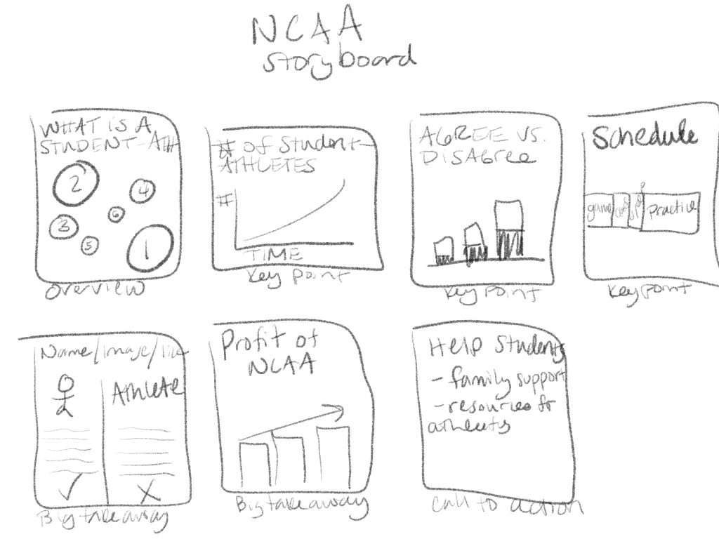
Overview: Amateurism/ what is a student-athlete? (define characteristic)
Key Points: Number of student-athletes over time (area chart) / Agree vs. disagree to pay student-athletes [from student-athletes] (bar chart) / the average schedule of an in-season student-athlete (scatter chart)
Big takeaways: Name image and likeness law (comparison of regular person vs. student-athlete) / Overall yearly profits of NCAA athletics (bar chart)
Call to action: how to support student-athletes (list resources)
Storytelling Techniques:
I want to explain to the audience why student-athletes must remain amateurs, how many student-athletes there are, and how many people think they should/ shouldn’t be paid. I will then explain the average schedule for an in-season student-athletes, name/image/ likeness law for students vs. non-students, and how much money the NCAA makes every year. I hope this information enlights the audience to the amount of work these students put in and how they never see a dime of the millions they make their schools ever year. To make this content engaging, I will provide different types of maps and charts for the reader to interact with.
The Aesthetics:
For this article, I plan on using the same color palette, marks, orientation, typography, and imagery to maintain a consistent look. Right now, I plan to use a bold color palette to reflect standard school colors like red, blue, yellow, and green. I plan to use a bold sanserif type to contrast the bright colors. To avoid chartjunk, I will only use bold colors to highlight the most important information in each graphic.
References
Tufte, E. R. (2014). Corrupt Techniques in Evidence Presentations. In Beautiful evidence (pp. 141-156). Cheshire, CT: Graphics Press, LLC.
Tufte, E. R. (2000). Visual and Statistical Thinking. In Visual explanations: Prints and sculptures (pp. 27-37). New York: Artists Space.

Leave a comment