
The Information
Many things in this world keep our ecosystem balanced. Trees and vegetation play a significant roll in removing carbon dioxide (CO2) from our air and replacing it with oxygen (O2).
“Deforestation is the permanent removal of trees to make room for something besides forest. This can include clearing the land for agriculture or grazing, or using the timber for fuel, construction or manufacturing.”
LiveScience
Right now, there is a combination of rising CO2 levels and constant deforestation. According to the Food and Agriculture Organization of the United Nations, “the area of primary forest worldwide has decreased by over 80 million hectares since 1990.” So, the opportunity to remove CO2 from the air and replace it with O2 is rapidly decreasing every year. The increase in CO2 in the atmosphere has led to global warming and it’s harsh effects such as melting glaciers, rising sea levels, and an increase in extreme/severe weather.
Deforestation in the US has occurred for many reasons. According to LiveScience, agriculture and logging were the two leading causes of deforestation.
Global Deforestation is an even bigger problem. According to the World Bank, the world lost 502,000 square miles of forests. That’s the size of South Africa.
So what can we do to help? According to Conserve Energy Future, there are many ways to help combat deforestation:
- Government Regulations
- Banning Clear-Cutting Forests
- Reforestation
- Reduce Consumption of Paper
- Education
- Eat Less Meat
- Use Sustainable Items
- Reduce Consumption of Deforestation Prone Products
We can all come together to fight deforestation. For more information, check out TheWorldCounts.com
The Visuals
The current information about climate change and deforestation are alarming, but sometimes we get desensitized to information. By converting the data into a visualization, map, infographic, or photo, the reader is more inclined to engage with the information.
Some experts call this visual literacy. According to the Integration & Application Network, there are seven principles for visual literacy for science communication.
- There are many forms of visuals that can be used for science communication including photos, conceptual diagrams, maps, graphs and videos.
- A diversity of visual elements enhances the appeal of science communication to a wide audience.
- The creation, selection, and editing of visual elements should be given as much attention as is given to text.
- Visual elements need to be fully integrated with text; not just sprinkled in and not distracting.
- Color selection should be internally consistent and recognize the cognitive impacts of different colors.
- Visual elements should have enough information or captions to allow stand alone comprehension.
- The process of reducing extraneous information in the visual elements (e.g., ‘chart junk’, ‘map junk’) allows the viewer to focus on the content of interest.
It’s no secret that science can be tough to understand and comprehend. By converting information into visuals, the reader can understand the data without an extensive science background.
Before looking at some deforestation visuals, it is essential to point out that the design choices of the visual matter as much as the data. According to a Science Communication article, there are five elements used to enhance visuals.
- Composition: used to organize the elements and establish their relationship to each other
- Abstraction: used to define and represent the essential qualities and/or meaning of the data
- Color: applied to draw attention, to label, to show relationships, or to indicate a visual scale of measurement
- Layers: used to overlap multiple variables to create a direct relationship in physical space
- Refine: the process of editing and simplifying
Now, there are many different types of visuals were only one of two of these elements apply. Overall, the images, graphics, or photos should present information in a clear and visually appealing manner.
Visuals in Deforestation
This section is dedicated to describing how visuals facilitate a viewer’s understanding of deforestation.
Chart
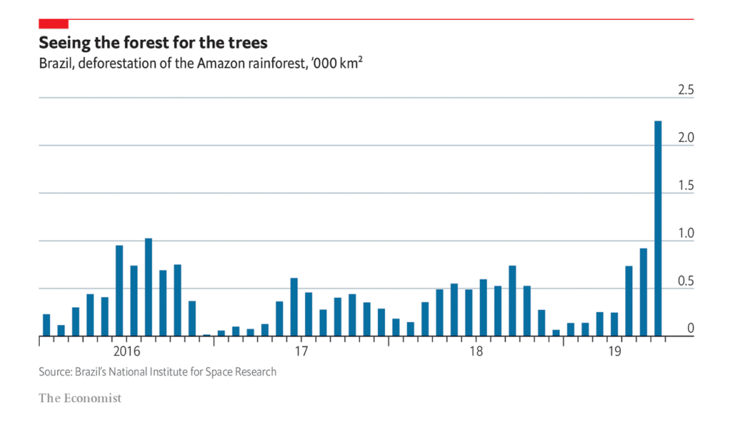
This chart represents the kilometers of deforestation in Brazils’s part of the Amazon. The viewer can see that there is a wave of activity with high and low periods over time. They can see that each hashmark represents one month over 4 years. Next, they could note the distance the chart represents. By breaking the chart into increments of time and space, the viewer will have an easier time interpreting the data.
For example, the most alarming part of the chart is at the very end. There is a sharp increase in deforestation in 2019, leading the viewer to ask why there was such a vast increase. With further investigation, the viewer would find the rise in deforestation is due to Brazil’s new president.
Map
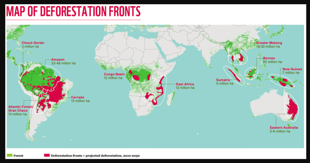
Maps are a great way to show geographical data. They could be detailed and interactive, or they can be simple and straightforward. This map represents the area of forest for each country.
Due to the green and red color, the viewer can see the countries and areas where most of the forests are located across the globe. Unfortunately, they can also see the vast amount of contrasting red color representing deforestation.
The map also shows the numerical data as well. The viewer already has a clear idea of the area, but seeing the numbers allows the viewer to compare and contrast other areas on the map.
Something the maps lacks is clarification. The creators did not clarify what constitutes as deforestation. As discussed above, there are my different causes of deforestation. This map also does not show the northern hemisphere. By neglecting that data, the viewer can assume that there is no deforestation going on in that area.
Photo

Numbers, graphs, and illustrations can be very powerful, but it is easy to desensitize from the information. By showing the viewer a photograph, they are able to connect to the image in a whole new way.
This photograph shows what deforestation looks like. The clear contrast between before and after is shocking and disturbing. It’s even more alarming to see that there is no type of construction of habitation of the area. If there is no one there, what was the point of slaying the forest and destroying thousands of animal habitats?
Even though the subject matter is alarming, the photograph is very strong. The composition, symmetry, and color make the photo seem simple, but it is incredibly powerful.
The capturing and production of news imagery and multimedia elements does not have to be complicated.
Mediashift
Sometimes the simplest of photos can leave a lasting impression. It’s also images like this that make photojournalism so important. This photo tells a very real and terrifying story, and now it’s up to the viewer to get inspired and make a change.
Infographic
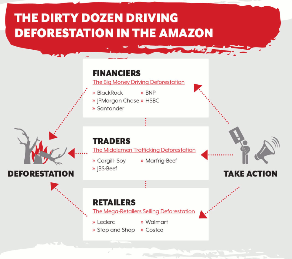
This infographic shows the companies and organizations that profit off of the deforestation in the Amazon. The viewer can see the multiple layers of the image to conclude a flow of information.
Once we immerse ourselves in a story, the action of looking at something becomes an experience. And an experience leads to an emotional connection.
Yotpo
The viewer can see that there are financiers, traders, and retailers that we need to take action against to help stop deforestation. It is alarming to recognize some of the names for very familiar companies. The only thing that we can do as a consumer is to stop giving these companies business and to spread the word of their dirty business practices.
Interactive Media
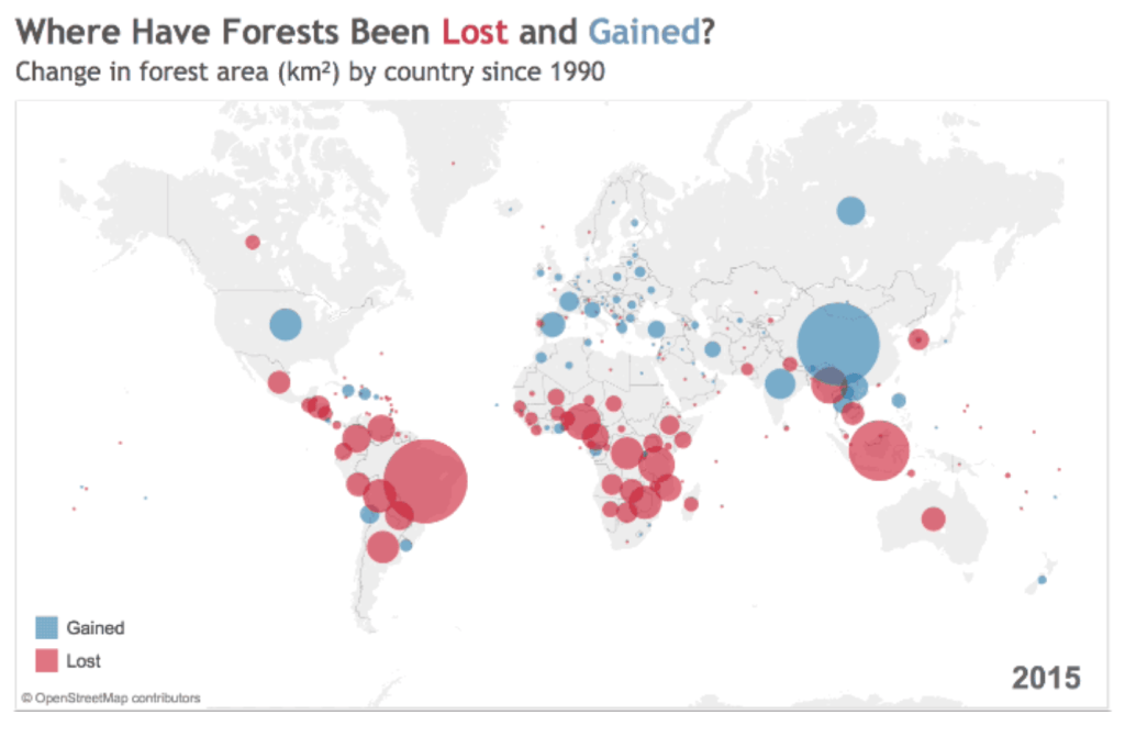
According to Scientific Storytelling using Visualizations, there are three important issues in the context of communication: comprehensibility, credibility, and involvement (Ma). The viewer can quickly see in this moving design the growth and decrease of deforestation over time. Coming from a credible source, the viewer can see the losses and gains of forest areas worldwide.
Conclusion
Overall, a combination of different visuals can help create a cohesive and extensive collection of information to educate the viewer on deforestation and how devastating it is to our world.
Visual Resources
Buczkowski, A. (2017, July 13). Top 20 most amazing maps you’ve ever seen. Retrieved October 04, 2020, from http://www.geoawesomeness.com/top-20-amazing-beautiful-maps-youve-ever-seen/ (MOD 5)
Estrada, F. C., & Davis, L. S. (2014). Improving Visual Communication of Science Through the Incorporation of Graphic Design Theories and Practices Into Science Communication. Science Communication, 37(1), 140-148. doi:10.1177/1075547014562914 (MOD 6)
How to Do Better Visual Journalism for Solutions Stories. (2017, December 02). Retrieved October 04, 2020, from http://mediashift.org/2017/11/visually-reporting-solutions-stories-newsrooms-classrooms/ (MOD 4)
Jones, A. (2017). Practical visual literacy for science communication. Retrieved October 03, 2020, from https://ian.umces.edu/blog/2017/03/28/practical-visual-literacy-for-science-communication/ (MOD 6)
Ma, K., Liao, I., Frazier, J., Hauser, H., & Kostis, H. (n.d.). Scientific Storytelling using Visualization. Retrieved October 3, 2020, from http://vis.cs.ucdavis.edu/papers/Scientific_Storytelling_CGA.pdf (MOD 6)
Zen, P. (2020, February 03). Storytelling Secrets For Creating Images That Connect. Retrieved October 04, 2020, from https://www.yotpo.com/blog/5-visual-storytelling-secrets-to-improve-your-marketing-images/ (MOD 5)
Deforestation Resources
Are the Effects of Global Warming Really that Bad? (2019, August 06). Retrieved September 30, 2020, from https://www.nrdc.org/stories/are-effects-global-warming-really-bad
Derouin, S. (2019, November 06). Deforestation: Facts, Causes & Effects. Retrieved September 30, 2020, from https://www.livescience.com/27692-deforestation.html
Derouin, S. (2019, November 06). Deforestation: Facts, Causes & Effects. Retrieved September 30, 2020, from https://www.livescience.com/27692-deforestation.html
Five forest figures for the International Day of Forests. (n.d.). Retrieved September 30, 2020, from https://blogs.worldbank.org/opendata/five-forest-figures-international-day-forests
Global Warming 101. (2020, August 10). Retrieved September 30, 2020, from https://www.nrdc.org/stories/global-warming-101
Rinkesh, A. (2020, June 12). Deforestation – Causes, Effects and Solutions To Clearing of Forests. Retrieved September 30, 2020, from https://www.conserve-energy-future.com/causes-effects-solutions-of-deforestation.php
Trees and Your Environment. (2020, August 24). Retrieved September 30, 2020, from https://www.cleanairgardening.com/plantingtrees/
University, S. (2019, December 17). Global carbon emissions increase. Retrieved September 30, 2020, from https://news.stanford.edu/2019/12/03/global-carbon-emission-increase/
Image Resources
Deforestation in the Amazon may soon begin to feed on itself. (n.d.). Retrieved October 04, 2020, from https://www.economist.com/graphic-detail/2019/08/15/deforestation-in-the-amazon-may-soon-begin-to-feed-on-itself
‘Deforestation fronts’ revealed. (2015, April 28). Retrieved October 04, 2020, from https://news.mongabay.com/2015/04/deforestation-fronts-revealed/
Finley, K. (2017, June 06). Using Satellites to Stop Deforestation Before It Happens. Retrieved October 04, 2020, from https://www.wired.com/2015/04/using-smart-satellites-to-monitor-deforestation-from-space/
Five forest figures for the International Day of Forests. (n.d.). Retrieved October 03, 2020, from https://blogs.worldbank.org/opendata/five-forest-figures-international-day-forests
Global NGOs: Dirty Dozen Companies Driving Deforestation Must Act Now to Stop the Burning of the World’s Forests. (n.d.). Retrieved October 03, 2020, from https://amazonwatch.org/news/2019/0830-dirty-dozen-companies-driving-deforestation-must-act-now-to-stop-the-burning

Leave a comment