
A book cover can serve many different functions. Depending on who you ask, a book cover could be a beautiful piece of art; to others, it’s merely a medium to sell the story inside. For an avid reader, the book cover is an opportunity to see the characters, setting, or important motif that influences the story. For marketers and authors, the cover needs to immediately grab the reader’s attention.
So, how is this accomplished? A book cover is marketing a story inside, so it needs to convey a compelling story on the front cover. To design what is considered a “good” book cover, the artist needs to use proper design principles, including expectations of the genre, and apply current trends. This will allow the marketing team and author to see their book more easily.
What Is A Book Cover?
According to Expert Journal of Business and Management, three design elements must be included on a book cover. There is text design, body, and cover/ series design. These three elements are what make up a book cover. Without one of the other, the reader might be confused and put the book back down. Remember, the purpose of a book cover is to sell the story to the reader. With missing elements, it will be harder to sell the book to the consumer.
Text Design
According to the article, the text design is the first level of understanding for the reader (Ebert, 2014). This text is used for the book cover, author’s name, and maybe a quote or “blurb” at the top or bottom. “A blurb serves you on the consumer marketing front, giving a glimpse into your story with just enough information to entice, holding back enough to avoid spoilers. It’s a teaser of your book, not a summary. (Kidder, 2020). This blurb could be from a fellow author or literary critic. Overall, these textual elements let the reader know the title of the book, who wrote it, and a little bit about the story.
Placement of the text and the typography on the cover is also essential. The style of the font should reflect the story within. For example, a literary fiction book should have a different font than a mystery/ thriller novel. Literary fiction is more poetic, while mystery/thriller novels are more suspenseful and intense.
Book Body
This is the design of the physical body of the book. For example, this section covers the size, typography of the text, line pinch, upper and lowercase, pages, paper, and other physical attributes. According to the article, these elements are essential to the psychology of the reading experience (Ebert, 2014). A pleasant reading experience could be many things for a reader, but the reader shouldn’t be struggling to hold or read the text itself.
Cover/ Series Design
Finally, one of the most critical elements is the cover design. “The cover and series design. The impact of cover design respectively series design cannot be overlooked, (Ebert, 2014). The cover is the first stimulus that the reader encounters and needs to lure them in enough for them to pick up the book and start reading it. Book covers and also leaves a lasting impression. As a bookseller, customers come in all the time and say, “I don’t remember the title or the author, but I know the cover is red.” This means that this person couldn’t remember any other information about the book other than the elements on the front cover. According to an article from Simple Psychology, we take in the information, but 90% of it is lost before it reaches the brain (McLeod). That means, for a cover or story to be memorable, something needs to make an impression on the reader.
How To Understand A Book Cover
Now that we know what a book cover is, it is time to break down how to understand it. According to Cultural Anthropology, there are three important elements to understanding a book cover. First, the consumer needs to see some sort of narrative. Then they need to be able to fit it into some type of category. Finally, they need to be able to identify with the cover. As discussed above, the reader needs to connect to the cover to remember why they picked it up in the first place.
First, the cover needs to tell a narrative. A narrative doesn’t need to have a scene to tell a story. The cover could display something as simple as a tree. Since it is a cover of a book, the reader can assume that this tree will mean something within the context of the book. Is this where an important event will take place? Does this story involve a lot of character development? The possibilities are endless. In contrast, the cover could include the title of the book and the author’s name against a white background. Here, the reader can infer that this is not a literary story and is most likely nonfiction.
Second, the cover needs to fit into a category or genre. As discussed above, there are expectations that the reader has for a particular genre. Fiction books tend to have more elaborate covers that leave a lot to the imagination. Nonfiction covers, on the other hand, leave little to no room for interpretation. Further exploration of genre expectations will be explored down below.
By breaking down the text, body, and series design, the reader will need to quickly understand the story, genre, and identify with the cover before purchasing the book.
Lastly, the cover must identify and lure in the potential reader. Remember, the point of the cover is to sell the book. It doesn’t need to be “pretty” or “aesthetically pleasing,” but it should let the reader know what is waiting inside.
How to Create a Good Book Cover
To create a good cover, the designer must keep some design tips in mind. The cover needs to grab the reader’s attention, reflect on the genre’s expectations, and reflect the culture the book is published in.
“Scholars in a range of disciplines, from literary criticism to psychology, have proposed that aesthetic experiences serve the useful purpose of helping the human mind to organize and comprehend complex, abstract, and/or impersonal ideas and information within a personally meaningful context.”
(Griffin, 2018)
Design Principles
To grab the reader’s attention, there are some design principles to keep in mind when telling the story. Gestalt theory and the design principles like symmetry, simplicity, and proximity are a great way to start. These design principles can be seen in some common cover trends today. Some of the principles include; similarity, enclosure, continuation, closure, proximity, figure-ground, simplicity, common fate, symmetry, parallelism, common region, and element connectiveness (Bushe). Over the years, other psychologists have added a few more design principles (Bushe). By following one of these principles, the design will not only create a great cover, but it will also be luring to the consumer to check it out.
Storytelling
The designer can elect to focus on multiple different storytelling techniques on the cover. From dramatic, non-dramatic, and interactive methods, the designer can always find an option that best suits the storying within (Bergström, 2012). Remember, storytelling is one of the ways that people perceive book covers.
Dramatic
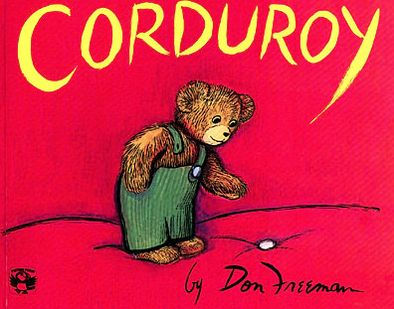
Dramatic storytelling in cover design leaves little room for interpretation (Bergström, 2012). This is the best fit for children’s books where the cover pretty much explains exactly what the book is about.
Non-dramatic
This method of storytelling leaves plenty of room for interpretation. Bergström says that there is significant participation from the audience to figure out what is happening. We see this mostly in literary and contemporary fiction.
Interactive
The last technique is interactive storytelling. According to Bergström, this is the middle of the dramatic and non-dramatic methods. This option guides the story, but also relies on the reader for deeper meaning. The best genre to describe this method is Young Adult books. Most YA novels display what is happening but leave a little clue on the cover that the reader won’t realize until the end.
Color
Another important element for a book cover is color. “Color plays a very large part in the mood and meaning of an image” (Gitner, 2015). As discussed before, “I can’t remember the title or author, but I know it has a red cover.” The red cover itself is the only thing that the customer could remember because it made a lasting impression on him.
Emotion
Emotions are very important for capturing a reader. By feeling some type of emotion, the reader will be more likely to connect to the cover or the story within. This connection could stem from the authenticity or relevance that they story or cover portrays. When the reader is relating to the book, before even reading it, you know it’s a great cover.
Chip Kidd
From Michael Chitons Jurassic Park to Davis Sedaris Calypso, Chip Kidd, a famous cover designer, sticks to simple, unique, and memorable covers. “Chip Kidd doesn’t judge books by their cover, he creates covers that embody the book,” (Kidd). In his hilarious and informative Ted Talk, Kidd talks about a good first impression and how cover designers give a story a literal face.

He then explains some of his creative process in coming up with his most famous covers. From reverse typography lessons to engaging the reader, Kidd does a great job of getting the reader to pick up the book and look inside.
Genres
Creating a genre-appropriate cover allows the reader to know what kind of story or subject lies underneath.
“We are at a pivotal moment in book cover design trends—it is no longer business as usual. Sure, the basic rules of book design still apply—covers must be clear, legible, and suited to the genre, all while projecting enough mystery to entice a prospective reader to pick it up off the shelf.”
(Morr, 2018)
Readers want and expect the cover to reflect the story inside. At the end of a book, a reader shouldn’t be confused about the art on the cover. Below are some of the common cover trends for each major genre.
Clues
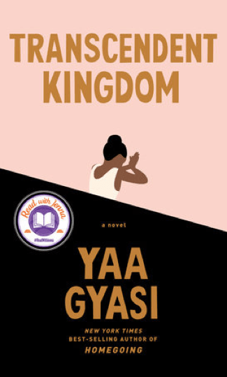
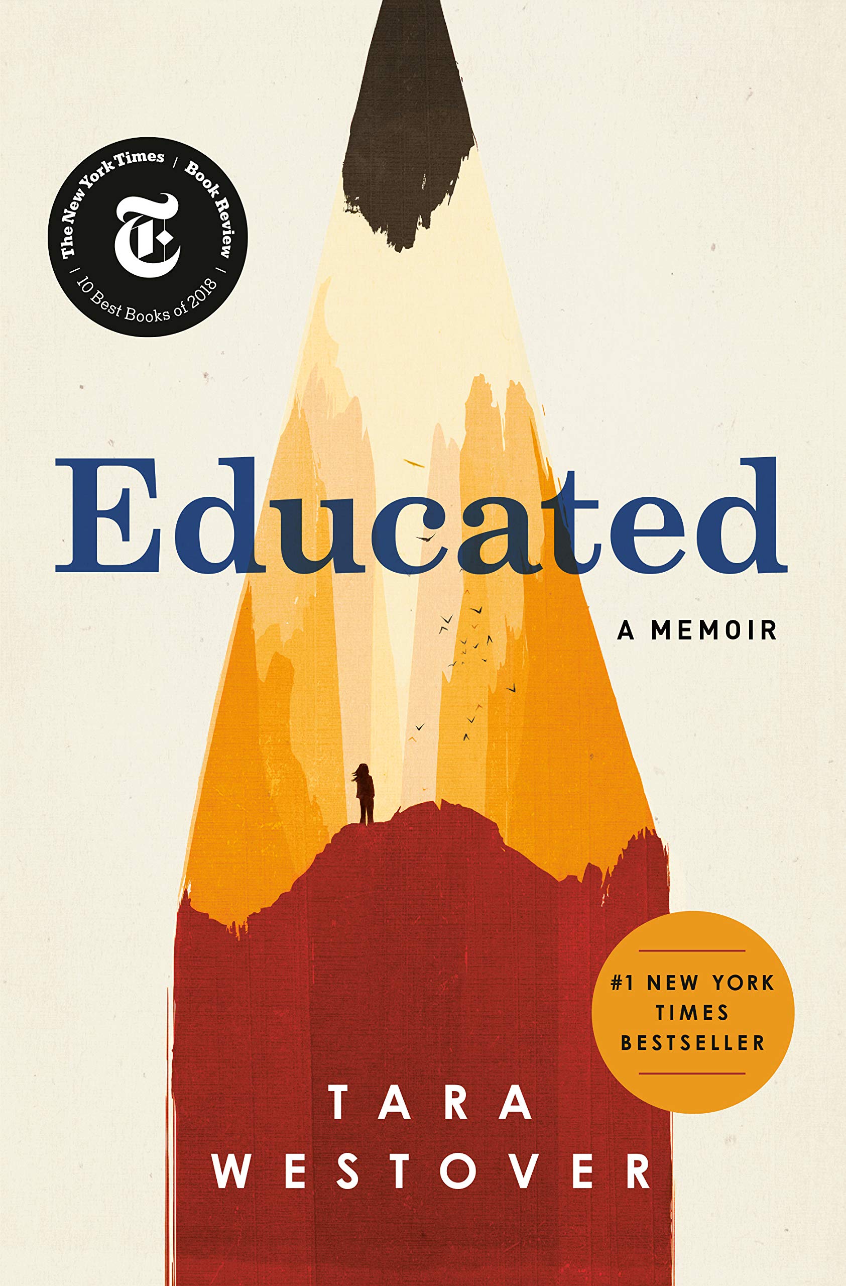
First, to figure out what type of story lays inside, designers like to stick with certain clues to tip off the reader to what they can expect. These clues range from the use of color, typography/ title, and whatever element is on the front cover. An easy example, a book called, 7 Habits of Highly Effective People, with a blue background and gold text, might sound like business or self-help. A more challenging example, Educated, might look like fiction, but it is actually a biography.

“Journalists have known for a very long time that some ideas are simply too awkward to communicate in words and that a visual representation can help someone understand concepts that might otherwise be impossible to explain.”
(Information Visualization)
The common visual clues (dark silhouette for mystery or a dragon for fantasy) draw the readers based on their interests.
Fiction
Before getting started, these are general statements about the genre as a whole and not by any means a full list of what should be included in each genre. Some books don’t fit into this model, and they are still beautiful works of art.
Fiction
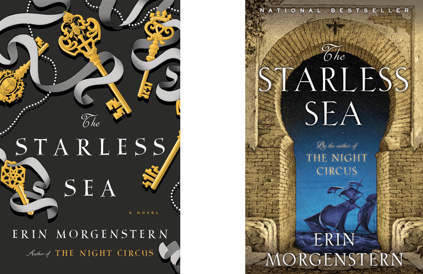
Fiction books have one of the broadest range of expectations when it comes to covers. In 2020, readers expect a fiction cover to be a piece of art that reflects the story. Whatever that cover could be, should reflect on the story inside.
Classics
Classic literature has seen dozens of covers in their days. From special editions, collectors editions, and anniversary editions, it will be hard to pick out a particular classic tale without a title. Since these books are so old, sometimes the covers feature a piece of art painted around the time the book was published. Other times, a publisher will create a “classics collection” where all the classics will have similar covers. Overall, when browsing a bookstore, prepare to see five or six different versions of A Tale of Two Cities.
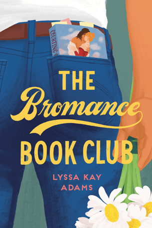
Romance
Romance books fall into generally three different categories. First, there are the classic cheesy romance novels. Almost all of them have a shirtless man on the cover holding a woman, or duchess, in distress. Next, there are the steamy, intense romance books. These covers are usually all black with some type of single object in the middle. Next, there are the cutesie or real life romance books. As of 2020, these either have an illustrated cover or a simple romantic scene with the couple on the front.

Poetry
Poetry, like fiction, has a wide range of cover designs. The most significant difference in design comes from the physical body itself. Poetry books tend to be smaller in size and page length.
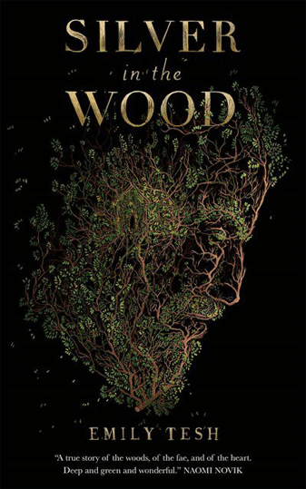
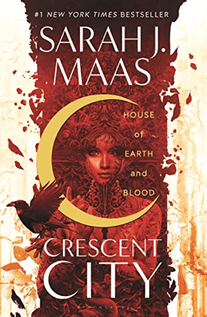
Science Fiction/ Fantasy
Sci-fi and fantasy books usually have intense covers. They range in photos of kingdoms, magical or mechanical creatures, or have the main character on the front.
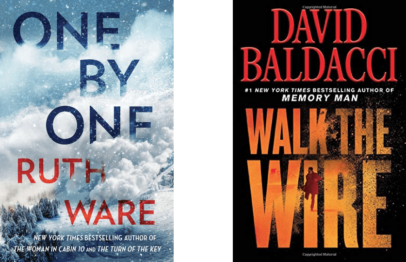
Mystery/Thriller
These books usually feature darker colors with misty, stormy, and creepy vibes. Sometimes the image is blurred or has lots of shadows.
Nonfiction
Nonfiction books cover a wide range of different genres with different cover expectations. As a whole, these cover designs are simple and effective for letting the reader know what’s inside. Nonfiction books are more about the information within than the design on the front.
Health and wellness
Health and wellness books differ depending on the subject matter. Personal growth and development books usually have bright colors, while diet books have simple white covers with different foods on the front.
Biography
Depending on the type of biography, some have a photo of the person the author is writing about, or there is a distinctive element that is important to the persons’ biography.
Business/ Science
Business and science books usually have straightforward covers with the title, name of the author, and publisher on the front. Like most nonfiction books, business and science books really focus on the information that is inside the book. These books are relying on the title or author’s reputation than the cover design.

History
History book covers usually have a yellowish tone to make the covers looked aged. Depending on the time period and subject matter, they might feature an image of a person, battle, or geographic area that the information takes place.
PR & Marketing
Book covers need to be pretty, but their true function is to sell the book to readers. To sell the book, designers and publishing teams need to focus on opportunity and attention. “With the modern influx of input, we have trained ourselves to make up our minds based on first impressions. When meeting someone face-to-face, it takes us 7 seconds to make a first impression,” (Zen, 2020). The cover of the book is the first opportunity to sell it to readers.
It is also important to note that the cover design shouldn’t be centered around the potential buyer. The cover needs to reflect the story that is within. There was a study conducted to see the influence of cover design and consumer choices. Scientists set up a camera to record the participant’s eye movement to see what covers drew them in. “The data of the experiment suggested that women from the age group 18-35 prefer books with cool color covers and the preference disappears with age; accordingly, men in the age group 56+ prefer books with warm color covers. The preference was not seen in younger age groups,” (Gudinavičius, 2018). With trends constantly changing, it is almost impossible and a waste of money to design a cover based on the audience. Plus, there is little evidence that cover design fully influences a reader to buy the book. The most the scientists could get is color preference, but it still didn’t affect everyone.
Some other marketing and PR aspects include current trends, hardcover & paperback, international covers, movie tie-ins, social media campaigns, and old & new covers.
Current Trends
Predicting which trends will come next is always tricky, especially in the publishing world. With covers being design months in advance, it is a hit or a miss to be on-trend. The three main trends include: silhouette, complex designs, or illustrated covers. Some smaller trends are “textured book covers, found materials, or handwritten pencil fonts in book covers” (Reid, 2020). Almost all of these trends apply to fiction or memoir because their trends are currently changing, unlike business or science, where they stay the same.
Silhouette
In fiction, colorful silhouette covers are all the range. Sticking with the illustrated movement, readers are drawn in its familial and straightforward vibe. These covers also follow Gestalt theory with simplicity, figure-ground, and proximity.

Illustrated
The trend of illustrated covers started in romance but has now taken root in fiction as well. These cover designs are similar to silhouettes in terms of design principles but usually have their own style.
Complex
Complex covers have taken over fantasy and young adult fantasy. These incredibly detailed covers offer so many different elements to look at. The reader could spend hours picking out each little detail.
Hardcover/ Paperback
Another marketing and PR strategy for publishers to release a book at least twice. First, in hardcover, then in paperback once sales start to dip.
“Publishers apply a product differentiation strategy, releasing a high-priced hardcover followed by a low-priced paperback version of the same title to address the segment that is less willing to pay (or more willing to wait). Currently, hardcover books account for more than 70% of total book sales, but paperback sales account for 53.6% of sales (in terms of value) within the category of fiction books. Therefore, paperback books play an important role in sales in the fiction genre, and the current trend is in favor of paperbacks having an even greater impact in the future,” (Stölting, 2011).
Regardless of reading preference, hardcover and paperback sales still count toward the sale of books.
Sometimes the publisher will decide to switch the cover when to transition to paperback. This could be due to multiple reasons, but a new cover entices fans of the hardcover version to pick up the paperback as well.
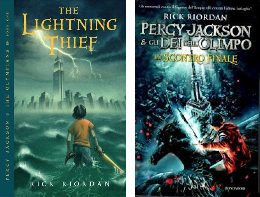
International Covers
A fun debate between avid readers is to determine with international cover is best. Each country has its own trends, expectations, and cultural influences. Like the US, it is vital to include all of these elements when designing a book cover. “It is believed that when a book is translated to a target language it will be adjusted to the social and ideological factors that are dominant in the target society. One of the items that will be adjusted, is the image and graphic design of the cover of the books,” (Salmani, 2015).
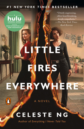
Movie Tie-in
When a book is converted into a movie or a tv show, most publishers will design a new cover for the book. These covers are usually similar style to movie posters with the main characters on the front. In terms of design, these covers are almost always photographs with the characters staged on the front.
Social Media
Today, social media is vital to any marketing strategy. To help boost buzz about upcoming books, publishers have started “cover reveal” events. About a week in advance, publishers will recruit social media accounts with large followings to post a photo with the cover that is about to be revealed. On the same day, these accounts will either post the same photo, or a unique photo with the cover photoshopped in, and write a promotional statement to tell their followers about the new cover/book.
Sometimes they will be a sudden “drop,” or they design a week-long event to get everyone excited for the release. Both strategies work, but depending on the author’s popularity, they will decide which plan to choose. Usually, smaller authors will “drop” a cover reveal on a particular day. In contrast, NYT bestselling authors will have a week of author interviews, games, or virtual events to generate as much buzz as possible.
The downside to these cover reveals is that they take place months, sometimes a year, before the book is initially released. This leaves plenty of time for people to forget about the new book.
Old to New
Sometimes these cover reveal events are for new books, and sometimes they are for new cover designs of older books. For example, various publishers have created anniversary editions, collectors’ editions, and just given the covers a new design.
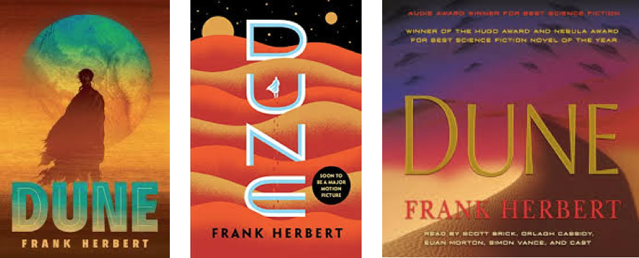
These new designs can be beautiful, fun, and regenerates excitement for the book. On the other hand, for a series, especially one that is not finished, publishers will sometimes redesign the covers in the middle of the series. Most of the time, for avid booklovers, they want their books in a series to match, forcing people to ditch the old covers and purchase the new ones. From a publisher’s point of view, this is smart, but from a consumer’s perspective, this can be very frustrating.
Conclusion
Books and covers should reflect the personality of the book inside.
References
Ebert, S. (2014). Consumer Psychology Insights and their Use for Operational Book Marketing. Expert Journal of Business and Management. doi:ISSN 2359-7712.
Griffin, D. (2018) Visualizing Eco-dystopia, Design and Culture, 10:3, 271-298, DOI: 10.1080/17547075.2018.1514573
Gudinavičius, A. and Šuminas, A. (2018), “Choosing a book by its cover: analysis of a reader’s choice”, Journal of Documentation, Vol. 74 No. 2, pp. 430-446. https://doi-org.libraryproxy.quinnipiac.edu/10.1108/JD-09-2016-0111
Kidd, C. (n.d.). Designing books is no laughing matter. OK, it is. Retrieved September 25, 2020, from https://www.ted.com/talks/chip_kidd_designing_books_is_no_laughing_matter_ok_it_is?language=en
Kratz, Corinne A. “On Telling/Selling a Book by Its Cover.” Cultural Anthropology, vol. 9, no. 2, 1994, pp. 179–200. JSTOR, www.jstor.org/stable/656239. Accessed 25 Sept. 2020.
Morr, K. (2018, March 20). How to design book covers for different genres. Retrieved September 25, 2020, from https://99designs.com/blog/book-design/book-cover-design-by-genre/
Reid, M. (2020, January 27). 7 Big Book Cover Design Trends for 2020. Retrieved September 25, 2020, from https://99designs.com/blog/trends/book-cover-design-trends/
Salmani, Bahloul, and Zahra Eghtesadi. “An intersemiotic approach towards translation of cover designs in retranslated classic novels.” Theory and Practice in Language Studies, vol. 5, no. 6, 2015, p. 1185+. Gale Literature Resource Center, https://link-gale-com.libraryproxy.quinnipiac.edu/apps/doc/A447038637/LitRC?u=a13qu&sid=LitRC&xid=35080cd7. Accessed 24 Sept. 2020.
Stölting C., Blömeke, E. & Clement, M (2011) Success Drivers of Fiction Books: An Empirical Analysis of Hardcover and Paperback Editions in Germany, Journal of Media Economics, 24:1, 24-47, DOI: 10.1080/08997764.2011.549428
MODUAL READINGS
Bergström, B. (2012). Storytelling. In Essentials of visual communication (pp. 14-27). London: Laurence King. (MOD 1)
Bushe, L. (n.d.). Simplicity, symmetry and more: Gestalt theory and the design principles it gave birth to. Retrieved from https://www.canva.com/learn/gestalt-theory/ (MOD 2)
Gitner, S. (2015). Multimedia storytelling for digital communicators in a multiplatform world. New York: Routledge. (MOD 1)
Information Visualization – A Brief Introduction. (n.d.). Retrieved September 25, 2020, from https://www.interaction-design.org/literature/article/information-visualization-a-brief-introduction (MOD 3)
Lien, J. (2020, March 04). Worth 1,000 Words: The 4 Principles of Visual Storytelling. Retrieved August 29, 2020, from https://actiongraphicsnj.com/blog/4-principles-visual-storytelling/ (MOD 1)
Mcleod, S. (n.d.). Visual Perception Theory. Retrieved September 25, 2020, from https://www.simplypsychology.org/perception-theories.html (MOD 2)
Zen, P. (2020, February 03). Storytelling Secrets For Creating Images That Connect. Retrieved September 25, 2020, from https://www.yotpo.com/blog/5-visual-storytelling-secrets-to-improve-your-marketing-images/ (MOD 5)

Leave a comment