

“Rule of thumb for UX: More options, more problems.”
— Scott Belsky, Chief Product Officer
Smartphones make our lives easier for many reasons, mostly because it’s a mini-computer in our hands. Still, the mobile apps on these devices are simple and straightforward versions of the web browser due to their limited functionality.
Unfortunately, even though it might seem like it, there isn’t an app for everything. There are some websites that don’t have any type of mobile application and probably won’t be getting one any time soon. For example, town websites, restaurant menus, and small businesses are great examples of content that don’t need to be converted into an app.
Since my hometown doesn’t have an app, I took this opportunity to check out the content and put together a diagram of all the possible information I could include.
To get started, I took a look at the information architecture (IA) of my hometown’s website. Basically, IA is a user experience (UX) method to help organize information in a structured and user-friendly way. There are many different types of information architecture. From site maps, content audits, and IA diagrams, these various methods allow the designer to break down all of the present information. Check out my other post here for more information.
Research The Site
Now that I know how IA works, I need to check out my town’s website on my phone to see what information is on there and how it changes from my desktop browser. I can take this information and start to come up with some ideas on how to rework the information into a better layout and presentation.

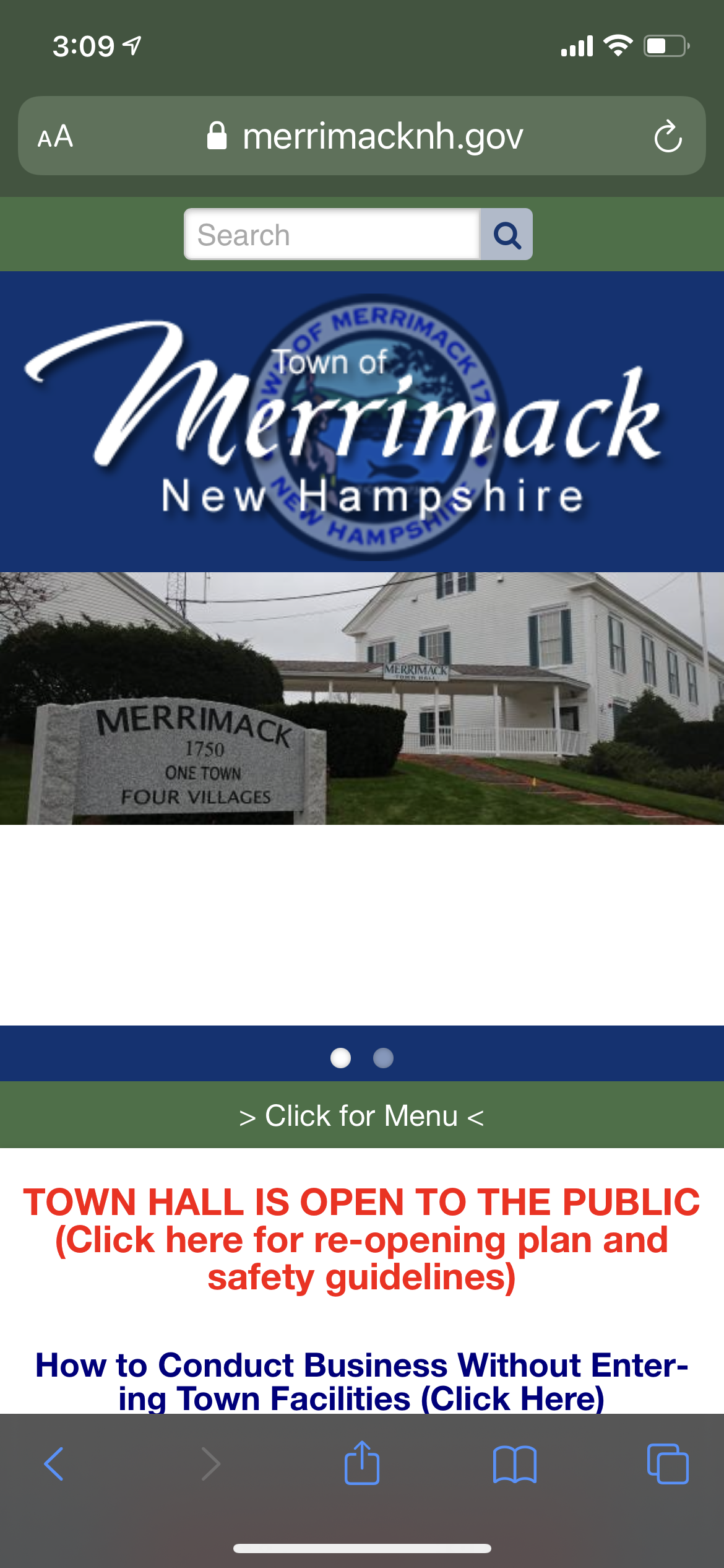
I can see that the header and image carousel are the same, but they take up a large majority of the initial screen real estate. It is also interesting that they decided to hide the navigation bar. I would have eliminated the logo and carousel in place of the navigation bar because that is what the users are going to utilize.

Menu and resource box for mobile device. 
Right under the hidden navigation bar is the Merrimack Resources box full of links and lists. This is full of critical information that gets buried towards the bottom. Then, there are four badges that are mismatching sizes and double the size of the Merrimack Resources box and header. These badges are way too big for the mobile version of the website, especially for a home page.
Information Architecture
The original information architecture of the site was a little all over the place. The content had some misleading titles and information in awkward places.


I rearranged the content into simple and straightforward categories based on the user. I focused on the resident, business, and government elements instead of departments, boards, and economic development. This way, the user identifies who they are and the site provides the information they are looking for. It also keeps unwanted information away from the user. An average resident doesn’t need to look at economic development, building permits, or licensing because they have no need for it. Putting it in the business tab allows the resident user one less option and allows them to find what they are looking for at a faster rate.
App AI
Taking the simplified information from the new webpage, I needed to make it even more simple for the app. A phone screen is a lot smaller than a desktop, and the way a user navigates the page is different as well.
Keeping that in mind, I decided to skip the departments and I Want To… pages and stay with the residents, business, and government.

The next big change was adding a visitor page under the resident tab instead of having it branch off from local/ visitor like on the website. First, it would be very rare for someone to download an app for a town they are going to visit. This page is intended for residents that would have a family member or friend visit and to gain ideas on some activities around town.
Other than that, I condensed more information under broad titles so there wouldn’t be as many options. Since the screen is so small, I didn’t want to overwhelm the user with too much information and choices in one place.
Insights
Reworking the information architecture for the app was an easy task, but took more time than I expected. I kept asking myself, “who would use this information,” and “where would they look for this information.” That was the moment I realized that a visitor to the town would never think to download an app, so why should I have visitors have their own section?
I also kept moving around different information like the voting section and school board. Voting could go under resident or government, and even though I have a board section, the school board is very popular and could branch off into different pages about the school district. At one point, I also had sports (Merrimack Youth Association, or MYA) section as well. I decided to move it under committees, programs, and services because sign-ups are twice a year.
Conclusion
It is exciting to think this is only the beginning of reworking my hometown’s website into an app. I got a chance to assess the current IA and build up a new one. I look forward to taking the next steps in this app’s design process.

Leave a comment