
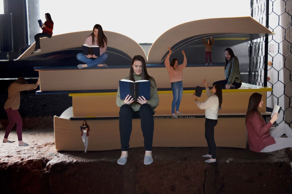
Sometimes a reader refers to a library or a bookstore as their “playground.” What if there was an actual playground for readers?
Any avid reader knows you sit, lay down, and stand in many positions while reading a great book. You establish a connection to the characters, and you don’t want to leave them for a second, even when you’re making a cup of coffee.
As a kid, when playing on a playground, you also find yourself in crazy positions. You’re up at the top, then at the bottom, or somewhere in between. Naturally, you go with the flow of your own mini-adventure.
The Story
At first, the image might seem like a random assortment of different positions, but they are more spontaneous improvisations of the reading process.
“One of the premises of spontaneous art is that it allows access to your subconscious and liberates you from inhibitions.”
— Robin Landa, Graphic Design Solutions 2019
When I get interested in a book, I’ll start sitting up, then laying down, flip over, and sit back up again. Not only am I constantly changing positions, but I am taking the book with me to get a glass of water or snack from the kitchen, with my eyes never leaving the page.
That is what I wanted to covey in this image. An organized chaos of what it is like to read a good book. That is why there are many readers in many positions.
Not only am I reading, but I am pushing and moving the books around. When I finish a good book, not only do I talk about it with friends, but I maneuver my bookshelves around to make sure my latest favorite is front and center.
The Process
I used photoshop to create this image. I took ten different photos, used the quick selection tool, and copied and pasted the selections into the background photo. Each reader, or element, was on its own layer, which made it easier for me to manipulate.
The Composition
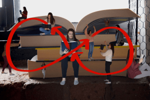
I attempted to create an asymmetrical design that used an infinity transition pattern so the viewer’s eye would never leave the image (Landa, 2019, p. 151). I wanted the reader to look at the reader in the middle first, then to loop around toward the top left, then down and around before coming to the center again. Then repeat the same process on the right. That is why the tallest reader is in the middle and carries the most visual weight (Landa, 2019, p. 144).
I also made sure to add some elements from Osborn’s Checklist (Landa, 2019, p. 97). I magnified, minimized, rearranged, and reversed the images so they weren’t the same size throughout the image.
What I Would Do Differently
After taking the time to reflect on the final product, I can spot a few things that I would change.
First, there is a lack of depth in the image. There is a small foreground, middle ground, and background. In real life, the windowsill is about eight inches, but at this angle, it looks even smaller. By taking the background photo at a higher angle, I would be able to capture more of the flat plane of the book and therefore giving more depth.
Second, I wouldn’t have the reader on the far right leading off the edge of the page. It draws the viewer’s eye away from the image, despite having the majority of the element on the page.
In Conclusion
My goal for the future is to create an image that doesn’t look obviously photoshopped. Once I gain more experience, I would like to try a similar exercise to assess my progress with the program.
Prof. John Heskett said that “design is to design the design of a design” (Hardt, 2006). From this experience, I have learned more about the design process, photoshop, and that my work could always be improved.
References
Hardt, M. (2006). Guest Professor. University of Lapland.
Landa, R. (2019). Concept Generation and Creativity. Graphic design solutions (6th ed.) (pg. 91-110). Australia: Cengage.
Landa, R. (2019). Composition. Graphic design solutions (6th ed.) (pg. 133-158). Australia: Cengage.

Leave a comment