
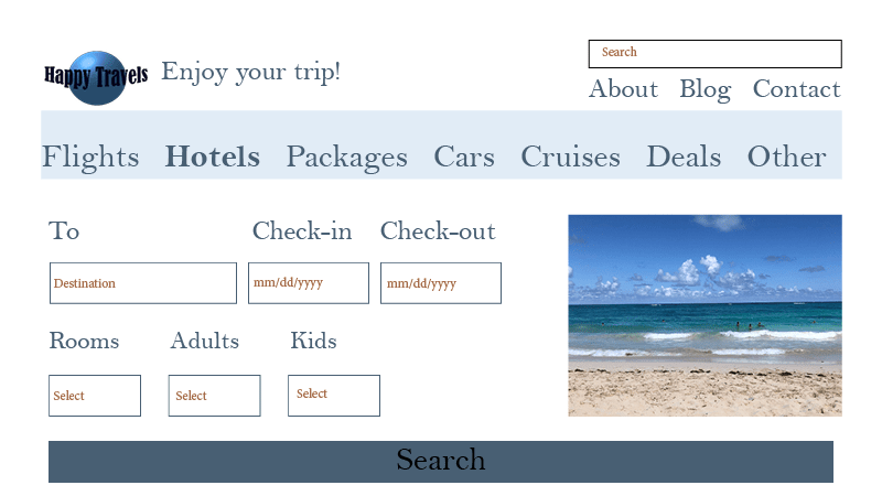
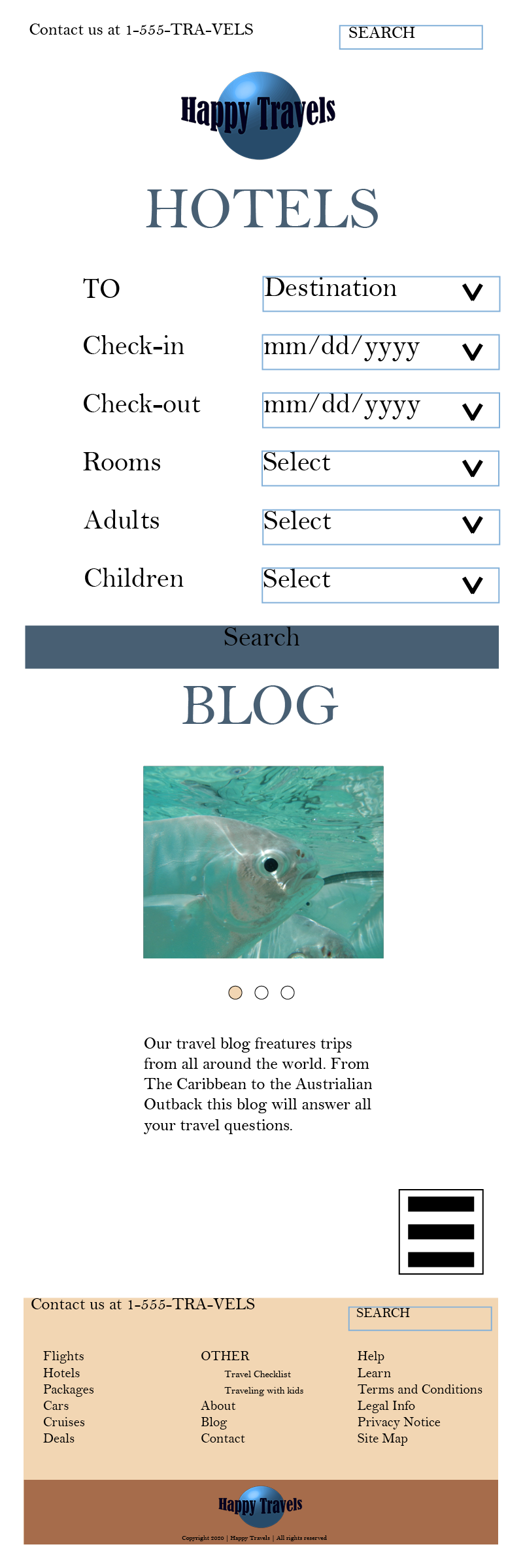
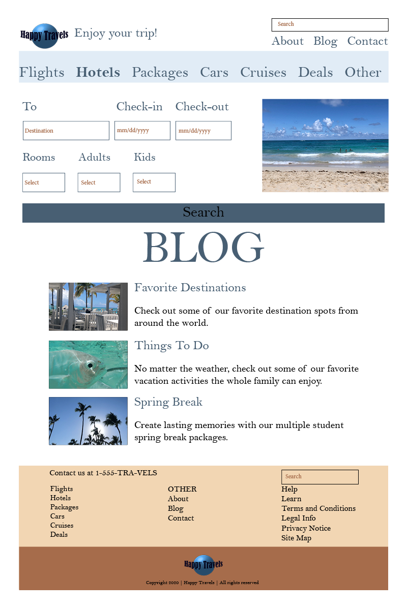
This week I created a mock-up homepage of a fake travel agency called Happy Travels. I quickly created a logo from a neutral palette of blues and came up with a simple tagline. I then came up with a simple color palette of beach themed blues and tans to represent the water and sand. My last step was to choose a font to create a consistent look for the homepage for a computer and a mobile device. After creating consistent branding elements, I started to research ideas on how to create an eye-catching and visually pleasing web design.
“Visual and functional continuity in your web site organization, graphic design, and typography are essential to convince your audience that your web site offers them timely, accurate, and useful information.”
Patrick J. Lynch & Sarah Horton, Web Style Guide
I looked at multiple sources of good and bad web design, and I even watched a video establishing the anatomy of a good web page. According to Charles Leonard Gorrill, a webpage should have a header, navigation, body, and footer.
In the header, I included the logo, branding statement, search bar, navigation pages, and contact information. When designing the navigation, I wanted to design something simple yet effective (Kolowich). I highlighted the navigation bar in light blue and used a darker blue to create a visually pleasing design.
For the body, I added two essential pieces of information, the hotel finder, and the blog articles. After looking up a destination spot, it is necessary to do your homework on the location, things to do, or if there is any cultural information you need to know beforehand. So when writing the copy for the mock blog posts, I wanted to create something catchy and persuasive (Kolowich).
The footer included all the vital navigation information as well as the legal and copyright. I provided contact information on a separate page, and I posted the phone number in the header and footer for immediate communication.
The main difference between the compute and mobile webpages is the layout. I kept the main information the same for both the homepages to create a consistency of the platform. I simplified and made each option bigger to accommodate the touch size of our fingers. I also added the thumb navigation tool at the bottom of the page to make operating the website easier (Brown). Since most people are right handed, I placed the box on the bottom right. I also didn’t add much color to the background so the text is easier to read on a small screen.
Overall, I learned a lot about web design and how to create clear layouts.
References:
Brown, D. R. (2009, November 19). Four Key Principles of Mobile User Experience Design. Retrieved from http://boxesandarrows.com/four-key-principles-of-mobile-user-experience-design/
Charles Leonard Gorrill. (2017, March 31). Anatomy of a webpage. [Video]. Youtube. https://www.youtube.com/watch?v=WOLYQgo-Fe8
Lynch, P. J., & Horton, S. (n.d.). Web Style Guide, Third edition. Retrieved from https://www.webstyleguide.com/wsg3/7-page-design/index.html
Kolowich, L. (n.d.). The Anatomy of a Winning Website Design [Infographic]. Retrieved from https://blog.hubspot.com/marketing/anatomy-web-design
 Jennifer Coffey
Leave a comment