
This week I created a travel brochure that included all of the elements of design that I have learned over the past couple of weeks. I used composition, color theory, typography, and visual communication to come up with an informative and visually pleasing design.
The Design Process
This week I was challenged to create a travel brochure that “broke the grid” of design.
I first started by taking a piece of paper and folding it into the brochure. I wrote down all of the information I wanted, and I began to rearrange the text based on priority. From the company name, slogan, and logo to a mobile app and company basics. Once all of the data was visible, it was easier for me to start designing a layout and then adding the body copy.
I knew from the beginning that I wanted to have one large image in the middle section of the brochure. This forces the reader open the whole thing to look at it.
After many frustrating hours of finding the right layout, I was able to add all of the text to the brochure. That is when I ran into many more problems that need solving. I was constantly switching colors, positioning, and photos to make the design readable.
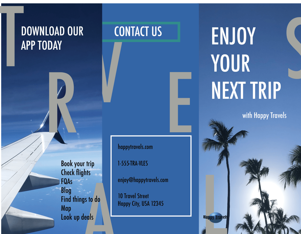
My biggest issue during the design process was creating organized chaos. As a viewer, I expect a travel brochure to look fun, beautiful, and relaxing. Anything more than that makes me confused. To break the grid, I chose to have images and text start on one page and bleed into the next. Settling on something simple and complex was very difficult.
Design Principles
Composition & Presentation
To make my design look balanced, despite the chaos, I needed to place the elements strategically so I wouldn’t create an overwhelming design. The letters in “TRAVELS” were particularly difficult to place. I wanted to create depth in the design, but I had to think of a composition where they are easy to read. I placed them in a downward slant to make reading the word more manageable. If the letters were high and low in a random order, then it would have been harder to read. I was a little hesitant to overlap the text and letters, but since the single letters are so big, they are their own element until they are combined while looking at the three panels together.

For the bottom page, the main image takes up most of the real estate. I wanted to remind the customer that Happy Travels is a relaxing experience and to have themself picturing themselves on a beautiful warm beach. On the bottom half of each panel, I put a background gradient moving upward to bring the customer’s eye back up to the relaxing image. Not only does this add depth to the design, but it is easier to read the text as well.
The margins for the brochure were simple. Despite trying to break the grid, I chose to have three panels on each side of the paper to create a true trifold. The margins equally separate each section, so all three are the same surface area.
Typography
Usually, to create consistency, I would use the same font for each element of a marketing campaign. But for this brochure, the font that I had used previously for the web design assignment, just didn’t fit the vibe of a travel brochure. I didn’t want to use any fancy or busy fonts, so I ended up going with a sanserif font for the entirety of the brochure. To create a hierarchy, I put all of the titles in uppercase while the body text was in lowercase.
Color
To create my color palette, I took the photo of the wave and downloaded it into Adobe Color. The software then generated a color palette based on the most colorful points of the photo. I then took those colors and used them for the gradients, “TRAVELS” letters, and frames. Overall, the palette is mostly blues, according to color theory, represent calm, relaxation, and vacation vibes.
Visual Communication & Storytelling
The visual communication with the customer is simple. Happy Travels will help you every step of the way to plan a comfortable, enjoyable, and memorable vacation. The calming beach and travel photos show a professional level agency that knows what they are doing.
Conclusion
Overall, I have redesigned this brochure at least 20 times, and each time I learned something new. From the colors not having enough contrast or the blocking of elements being too cluttered, I kept pushing through to create the best design that I could.

Leave a comment