

Dear Data
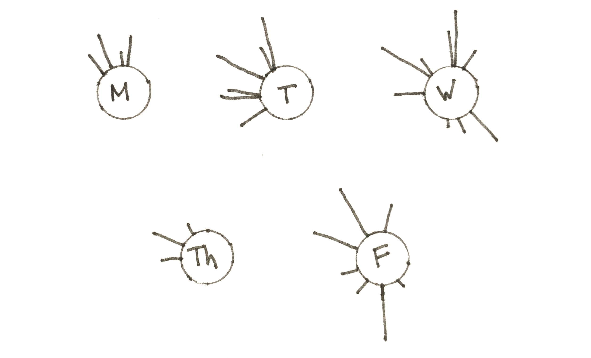
For the past couple of weeks, I have collected small data sets about the books I own (and have not read yet), my Animal Crossing habits, and how long I use my iPad every day. Without the conscious effort of collecting data, I would have never noticed the trends and insights that I found while looking at the information.
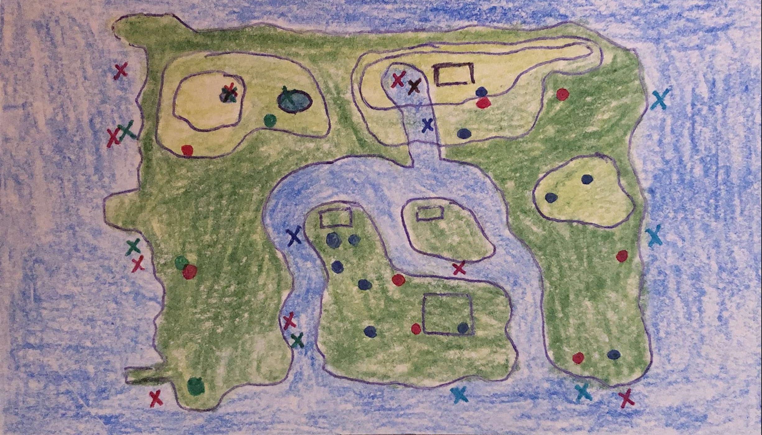
One of the first things that I learned was that you can collect data on pretty much anything. I never imagined that I could record data about what bugs and fish I collected while playing a video game.
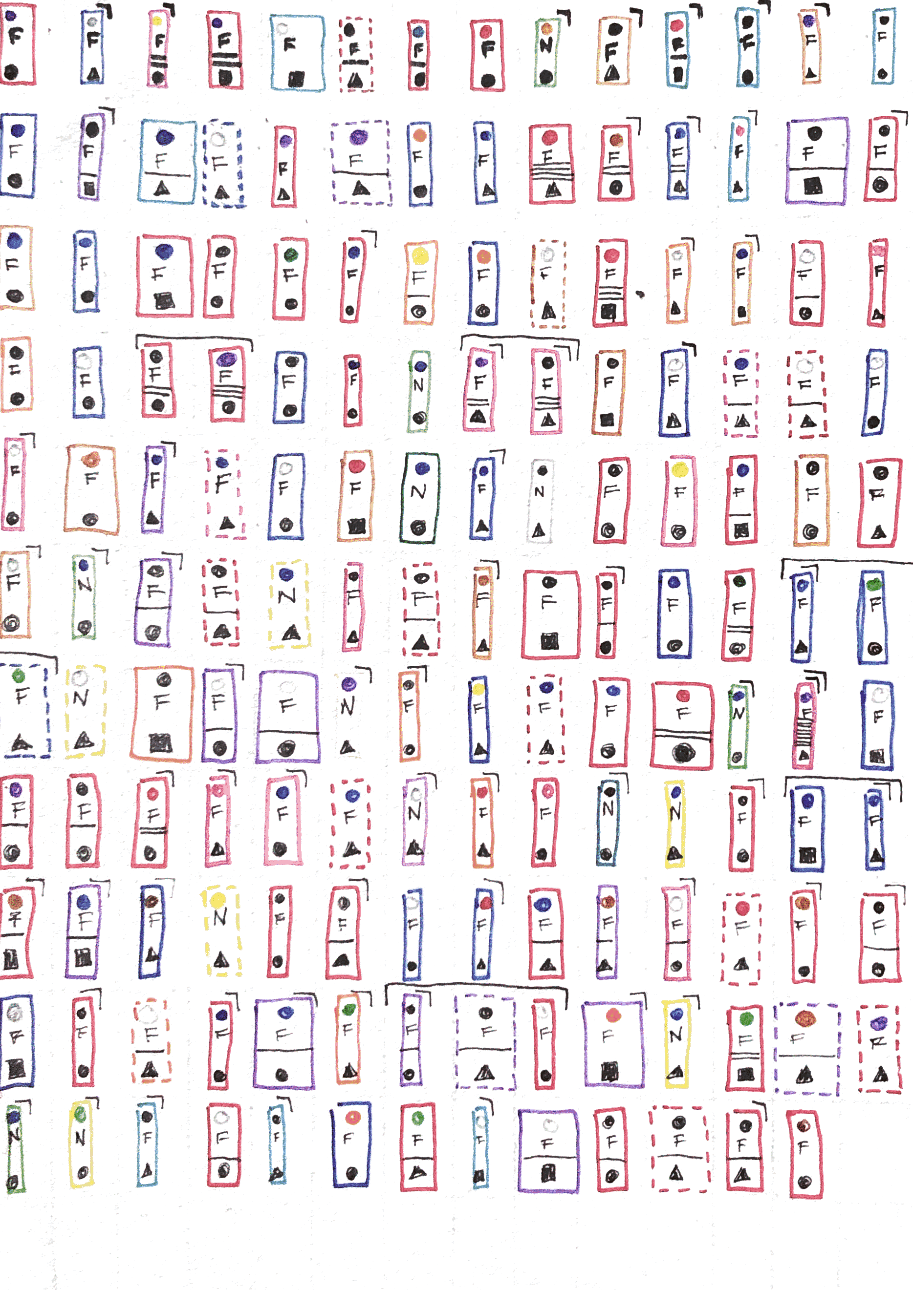
The hardest part of the whole process was cleaning the data. There was so much information that I would have loved to show! From the different sizes of each animal to the time of day I caught them in my net. All of these things I recorded but they never made it into the final visual.
While I was cleaning the data, I realized that I didn’t need to include everything. Some things, like species, would have been hard to visualize and didn’t necessarily add to the story of the data. My Animal Crossing visual focused more on where the animals were and not what they were.
Datawrapper vs. Manual Visuals
Learning to design computer-based and hand-drawn visuals are very important because it allowed me to represent all types of data sets. For example, I can’t create my Animal Crossing visual in Datawrapper.
The manual visuals allowed me to come up with an original design to show off the data in a creative way. The only drawback of this method is how time-consuming it is to come up with an idea and get it down on paper on the first try.
The technical data tools enabled me to visualize large data sets to make it easy to read. Looking at the line and bar graphs allow us to see trends over time. The drawback of this method is the time it takes to put the numbers in an Excel document and then trying to figure out which visual displays the data the best.
Telling a story
From the number of books I own to bring awareness to climate change, my experience with Dear Data and Datawrapper has shown me that almost all data tells a story. By using visuals to help tell this story, we connect with the audience by presenting the information differently. Instead of reading statistics in a paragraph, they can see the trends over time in a visually pleasing line graph. Now, the viewer can ask their own questions and make their own conclusions from the data. Hopefully, the graph will inspire them to look more into the information.
In the future
As an avid reader, I love writing book reviews. Unfortunately, I am not very good at writing them. I am not very poetic, and I don’t want to add any spoilers either. So, I’m stuck writing concise, choppy, and vague reviews. By using my new knowledge about data visualizations, I plan to create visually book reviews. I would love to come up with these beautiful, abstract, and original that will leave the viewer wanting more. I have no idea how that will work, but now that I have built a foundation, I look forward to creating my first visual book review!

Leave a comment